Behind The Mask: Hand Building With Clay

Behind The Mask: Hand Building With Clay

I had the opportunity to teach “Hand Building With Clay” to students in grades K – 4 for the City of Santa Monica’s  CREST Enrichment program.

After learning the pinch pot, coil and slab techniques, students had the opportunity to use slabs (pancakes of gently flattened out clay) in a different way, by laying the slab of clay over a sort of armature of loosely balled up up newspaper, so that it would harden in a shallow bowl form, and create a mask.

As the forms dried, and the clay hardened, the newspaper was removed, and the clay became ready to paint, embellish and add to.

Some students chose to use the convex surface of their half spheres or hemispheres as a place to create symbolic forms and shapes such as stars and hearts, rather than a face or character.
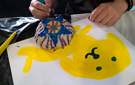
Students played with using the paint pens by working on paper first.
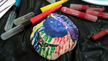
The paint pens allowed them freedom from choosing and washing  brushes, adding water, and controlling “loose” acrylic paints. They could use the paint pens to create intricate patterns like a drawing tool.
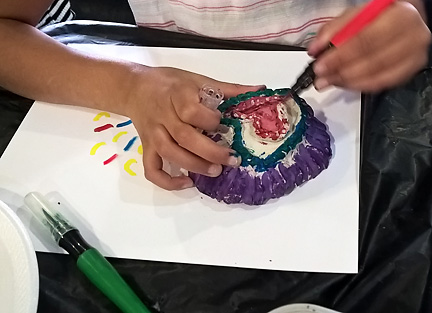
Students learned to pounce or “stipple” with the paint pens, using their tips to apply paint to creases and crevices in the clay.
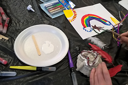
Students could then add feathers, beads, pipe cleaners and other embellishments to their masks, to further develop their characters, designs, forms and images.

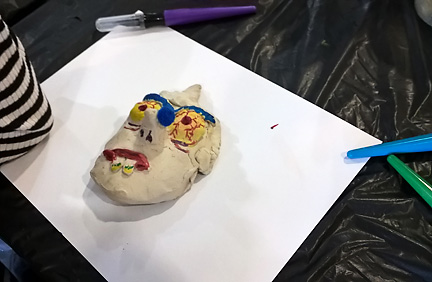
Some chose to focus on color through painting, adding a carefully chosen addition to enhance their character.

This young artists has incised, or drawn into the clay to create they eyes, and added clay to build out the nose. The mouth uses both techniques.
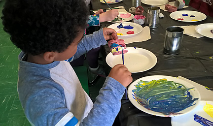
Students used foam plates to mix new colors on, as well as for palettes.
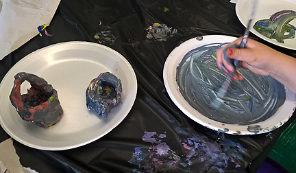
Mixing all the colors together was a popular choice, and helped the students to understand some of the principles of color mixing.
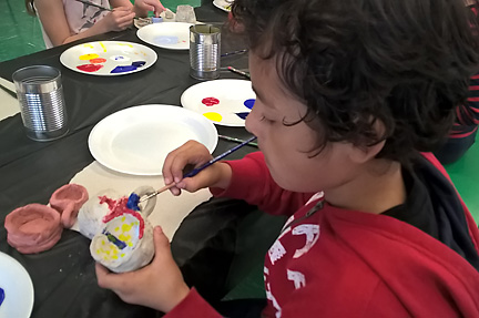
Detail and focus ruled, even with the younger children.
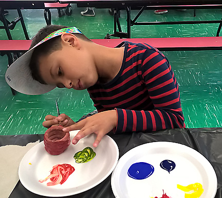
This young artist has mixed the secondary colors of green and orange, from his palette of primary colors, red blue and yellow.
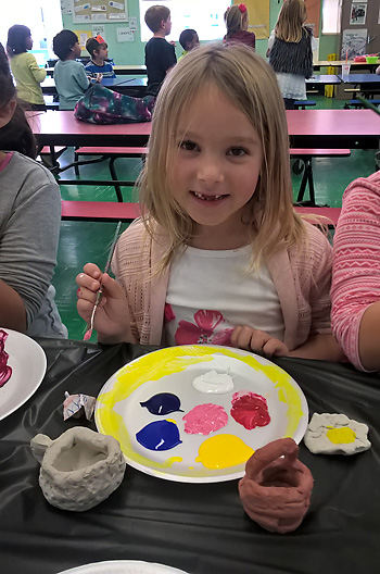
We used both grey and red air dry clay.
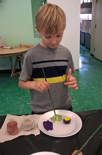
Here a young artist mixes green…after painting the outside of the pot blue, and the inside yellow.
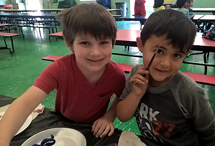
These two kindergarteners had a wonderful time painting and creating together!
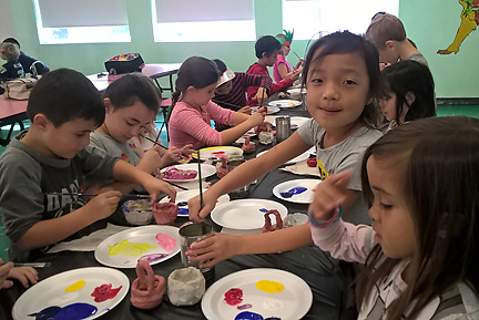
There is something about painting that seems to clear out irritability, and at least temporarily suspend human anxiety.

It is wonderful to see creative”flow” in action!

The Gift of Compliments

The Gift of Compliments

Today we are celebrating the complimentary pair, yellow and purple, which shows up in nature, architecture and signage, but can always take our breath away.

Compliments1

Opposite each other on the color wheel…the pair creates both harmony and drama, the contrast of which can be softened by the hues of their surroundings.

Compliments2

If complimentary colors are mixed together, they “neutralize” each other’s color “properties (akin to mixing black and white ), and can create beautiful grays and rich browns.

Compliments3

Juxtaposing yellow and purple can create instant associations: royalty (royal purple and gold), springtime (purple crocuses with yellow centers), and holidays (I will let You figure that one out…).

But most often, I feel, our reaction is simply that of pure joy.

Color…is energetic…so…  EnJoy!


Standing our Color Ground III

Standing our Color Ground III

Having completed a rather large and multifaceted color consultation for a set of two buildings, named “ARIA”, and “SONATA”  which anchor opposite corners of a block in the “Valley”,  I am disseminating the experience, and its results through a series of blog posts.

Here I compare and contrast the two buildings, one on either end of a median-sized block in Canoga Park, a district in the San Fernando Valley, about 25 miles northwest of downtown Los Angeles.

WEBar

We start with samples…right on the building, looking at two potential palettes. .

web1

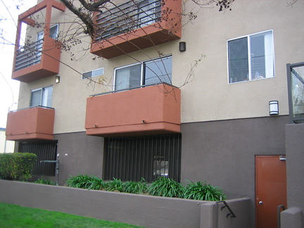
The darker foundation grounds the building ARIA, punctuated with symmetrically placed balcony “bump-outs”.

wb2

On SONATA, on the other end of the block, the same accent color was used on the bump-outs, with less of a jump in hue between the field and foundation colors.

web12

The service door takes the bump out accent to 200%…animating the deep foundation.

wb5

Fewer but larger bump-outs on SONATA create a different effect. We are working with broader planes of color here, which, along with less contrast between the foundation and field color, help offset the visual “busyness” that. could result from the use of of both stucco and siding

web6

ARIA’s inner courtyard, softened by use of plants down the center, offsetting and complimenting the earthy orange, cream and brown hues of the building.

wb9

In SONATA’s inner courtyard, a softening effect is achieved with the awnings, as well as the vista of green leaves from the tees beyond.  As there are no bump-outs or patios here in front of the units, the effect is almost that of an empty village street.

web7

Accented bump-outs offset the stronger door color, which punctuates the walls of ARIA’s courtyard.

wb7

A poetic melding of colors humanizes SONATA, front and back.

Next up, “THE DEETS”….a fun look at some of the details which humanize a building…This is where people live, after all.

See you next time…singing our color song!

Until then, may the Arias and Sonatas of your life create a perfect harmony…and the music of your colors  and the colors of your music play beautifully together.

Tracking Texture and Giving Thanks

Tracking Texture and Giving Thanks

The palette of warm gray/green, with terracotta/brick hues…translates from architecture,

to walkways,

to utilities,

and back to architecture again…

sometimes combining materials and textures in new and unexpected ways.

The type of material, and its texture, offer us a myriad of ‘takes”, on the colors, and how they play together.

Stone,

the glory of weathered wood, artfully used,

even concrete…reveal their charms, as the value, intensity and emotional impact of their colors shifts through their textures.

Nature’s palette too, plays out differently through texture….elegant branches punctuated by new green leaves against smooth ivory walls,

and  new life pushing its way indomitably through rock…

Let Us Enjoy These Gifts!

Giving Thanks this Season, for the never-Ending Wonders of our World, and the Power of our Imaginations to Create With Them Continually.

Peace and Blessing to All this Thanksgiving Holiday

Color: Culture, Trends, and You


Color: Culture, Trends, and You

Over the summer, during our “Color Muze” segments on Artistically Speaking Talk Show,  we have focused on the Color Experience Pyramid, as outlined by color expert, Frank H. Mahnke of the International Association of Colour Consultants/Designers .

As described in the posts, “Pyramid Scheme”  and “The Embodiment of Color”, we experience color on a number of different levels, and Mr. Mahnke has developed a  ” pyramid scheme”  to organize them. This schemata looks like a  broad-based triangle, and is composed of six levels, starting at the wide base with our biological responses to a color stimulus, and ending at its pointed tip, with our personal relationship to  color.  In other words, the Pyramid levels move from the general to the specific.

Here’s to the red, white and blue…and, yellow!?

We are influenced by our cultures, and this affects how we experience and use color, and our emotional response to it.   Top 1 Oil, a company that produces and provides, you got, it, petroleum products, uses the colors of the American flag in its logo, along with sunny, optimistic, and energetic yellow.   Do we feel energetic when we view this logo?

In addition to presenting a logo and branding that encompass all three primary (red, blue, yellow) colors,  supported by white, aka, purity, this color combination reads patriotism plus.  The yellow adds brightness and warmth, relating to an image of golden oil. What a message of hopefulness, buoyancy, energy (oil = fuel,/sunlight = energy = fuel) and forward movement!

Very few of us, no matter how individual we may want to, or feel ourselves to be, can resist at least some influence of current fashions and trends. The  Color Marketing Group (CMG) mwebsite states that they are ” the premier international association for color design professionals. Our mission is to create color forecast information for professionals who design and market color. ”  There is a whole world of those forecasting the next color trend, or “color of the year”, and like it or not, they exert great influence over what we see on the runways, on the road, on our walls, and even  on our bodies.

Yet, what goes into these trends?  There must be some combination of cultural experience, current events, environmental states, and the impact of history that informs them.

Mid-Century … modern once upon a time…

As I share in my post, Featured Work: “Mid-Century Retro”:   Starburst, Atom, or Tinkertoy?Mid-Century Modern design style, both in its “original’ format more than a half a century ago, and in its many personalized revivals, encompasses specific colors, textures, shapes, and patterns.  These comprise a style or trend, that was fresh, “a la mode”, and au courant” at one time, and has now become retro, beloved by some, whimsical to others, fun and even intriguing to many.

Paradoxically, Mid-Century Retro and its accompanying earth tones, burnt oranges, grey and gold hues can be seen as a current trend or fashion, even though its original style is no longer fresh and new, or in the van guard.  The fact that this style is nostalgic (depending on when you were born…or, not) can, pun intended, color our emotional and aesthetic response to the palette.

Finally…to the personal..our Personal Relationship to Color….

So, why do we love what we love?

I quote Frank Mahnke, who says, “…the “color experience”, or, how we experience color, is made up of the inter-relationship and connection of all the levels of the pyramid….we, within our life and according to mood, change color preference….An expression through color…characterizes us, and gives an indication of who we are as individuals.’

Serving up some  specific Color Choices…

Bright colors on an exterior mural….what the client wants to see outside her kitchen window…

The purple sunset sky desired by a young girl for her bedroom ceiling….

Magical colors on the exterior of a building brightening the foggy weather…

Knowing the “theory”…, color theory that is, can help us make these choices, and feel as though we are on the “right”  track.

Our experience of color through nature  is direct, primal, and  visceral.  Also, most likely, backed up by theory, if we really look at it.

Nature, color and art, are they separable?  What do You think?

What is the influence of culture and trends on your personal relationship to color?

If you are so moved, please share about it with us here.  We love to hear from You.

Remember, we are all coloring in this thing called Life, together.