A Saga of Flying Cranes: Process
I have had the opportunity, the honor, really, to work on a very special project for a historical residence, in the historical West Adams District of Los Angeles. I was brought in by an architect specializing in the restoration and preservation of historic buildings to transform a custom cabinet, designed to cover the living room television set, into a singular work of art.
I worked closely with the architectural firm, and project manager, interfacing with the owner, interior designer, builders, and foreman, as we developed the design from concept to a specificity of colors,textures, materials and composition.

Along the way, I amassed and created inspirational images, painted, gilded and stenciled mock-ups, to scale drawings, and numerous samples.
Once inspired by images, and with the design process determined, it was time to bring the rubber to the road…and take the concept to the surface!
The inside of the four cabinet doors were stenciled with a customized motif that was variously rotated, flipped and reversed into variations that were combined to create an elegant, complex, yet fluid composition.

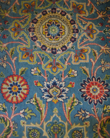
The individual motifs, and the pattern they created when combined were designed to complement and reflect the pattern in the rug,
and the carved images of a free-standing wooden cabinet in the room.

Even the decorative heating grate cover is an inspiration, and is integrated into the overall design and feel of the room!

The architect’s office created a mock-up from copies made from the stencils themselves, and put together in the desired sequence for reference, to insure no mistakes were made.

Due to virulent vigilance, none were.

Stencils based on the chosen designs were drawn out to scale on acetate, a clear plastic material often used for this purpose, and hand-cut using an xacto knife, on a “self-healing” cutting mat.

Once the stencils were used, colorful paint residue made it easier to see their pattern, and also served as a color guide. The hand-cut stencils can be too delicate to wash off, so the paint stays on them.

After careful measuring and positioning, the stencils were taped into place over the primed, latex base painted, gold painted and several times stippled door panels..and the colors were applied in a stippled (or pounced),and layered fashion.

Stenciling is truly the art of delayed gratification…the total effect can really only be seen when done. You have to love it. If you do, the effort, the care, the patience and the high wire act is worth it. It is for me…I truly love the process, and how complex the results can become.One of my favorites is the extraordinary ceiling of the Chicago Stock Exchange Trading Room, housed in the Chicago Art institute.
After the stenciling was completed, three applications of composition gold leaf, also called dutch metal or schlag, were applied to the front side of the doors. Each surface was delicately sanded in-between, with a fine sandpaper of 400-600 grit. Visual delineation of the squares of gold leaf was the desired look. The surfaces were then sealed with a coat of oil varnish designed for use over dutch metal, to prepare it for the painting. Dutch metal will tarnish with any contact with water media, so this varnishing step is crucial.

Finally, the initial painting of the “saga of flying cranes’ began…first in primer, as the paint is acrylic, and it would not stick to the oil-based varnished surface. Washes of color in acrylic were then built up over the surface, and detail laid in. The painted surfaces were lightly sanded between paint applications, to keep it smooth and satiny.

More color details were added to give depth, dimension, and a bit of pop to the scene.
The colors were carefully chosen and designed to work with the room’s rug,

(glorious colors and patterns…found by the amazing architect and designer and their team.)

fabrics, textiles and accessories…(some might say that pillows are necessities!),


as well as the wall colors and finishes in the room. The undertone of deep blue violet in the birds also provides pop against the complimentary gold background.

It was important to the architect that the crane’s feet have personality!

Inspired by the film, “Winged Migration“, these cranes have grit and determination…they are going somewhere, and they are going to get there!

On-site in the residence, I treated the sides of the cabinet in the same stippled fashion as the interior surfaces of the door…but no stenciling here. I applied layers of stippled color over the primed, them base painted, then gold-metallic painted surfaces, as was done with the inside of the cabinet doors above.

The room is handsome, serene, streamlined, and somehow both warm and inviting, and cool and elegant.

I am looking forward to gong to the site soon, to see and photograph the doors installed and the cabinet as a whole.

When I do, I think I will be tempted to say…”You’ve come a long way, baby! You’ve flown the coop!”
Are You looking forward to flying in this New Year?
I hope You are able to take flight in 2013.
As we know…time does fly…so let’s fly with it!
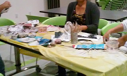
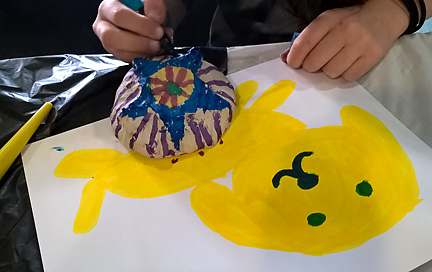 Students played with using the paint pens by working on paper first.
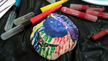 The paint pens allowed them freedom from choosing and washing brushes, adding water, and controlling “loose” acrylic paints. They could use the paint pens to create intricate patterns like a drawing tool.
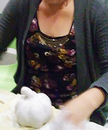
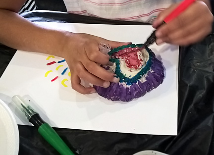 Students learned to pounce or “stipple” with the paint pens, using their tips to apply paint to creases and crevices in the clay.
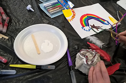 Students could then add feathers, beads, pipe cleaners and other embellishments to their masks, to further develop their characters, designs, forms and images.
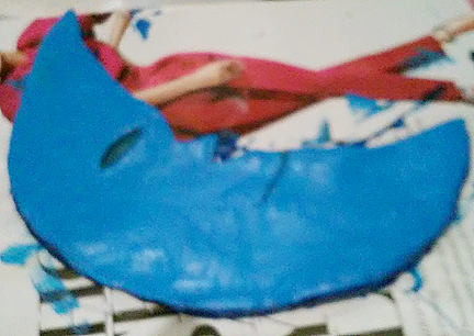
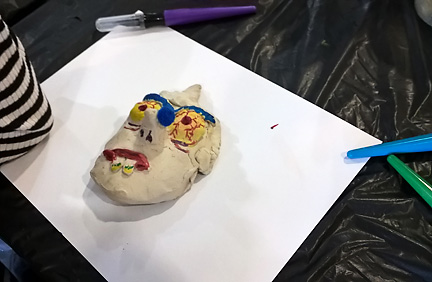 Some chose to focus on color through painting, adding a carefully chosen addition to enhance their character.
 This young artists has incised, or drawn into the clay to create they eyes, and added clay to build out the nose. The mouth uses both techniques.
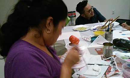
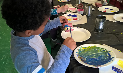 Students used foam plates to mix new colors on, as well as for palettes.
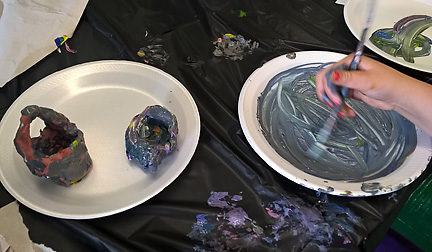 Mixing all the colors together was a popular choice, and helped the students to understand some of the principles of color mixing.
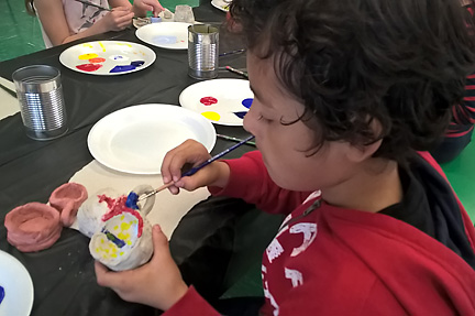 Detail and focus ruled, even with the younger children.
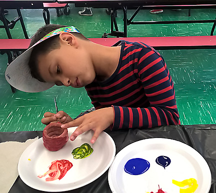 This young artist has mixed the secondary colors of green and orange, from his palette of primary colors, red blue and yellow.
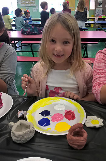 We used both grey and red air dry clay.
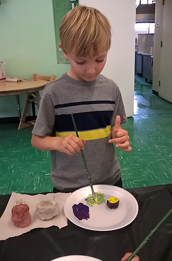 Here a young artist mixes green…after painting the outside of the pot blue, and the inside yellow.
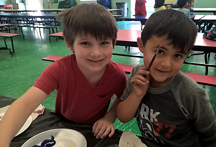 These two kindergarteners had a wonderful time painting and creating together!
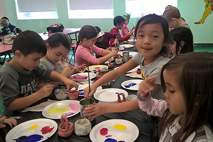 There is something about painting that seems to clear out irritability, and at least temporarily suspend human anxiety.

 The following week, participants used


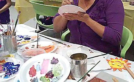 Adding detail. Every brush I brought seemed to have been used!


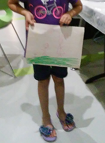
 He said it was his first time painting…he must be a natural. What talent!