André Derain at the Musée d’Art Moderne de la Ville de Paris

André Derain at the Musée d'Art Moderne de la Ville de Paris

On a recent visit to Paris, we visited the  Musée d’Art Moderne de la Ville de Paris and saw an amazing show of titans Andre Derain, Alberto Giacometti, and Balthus.

My husband Mark, an actor, and quite sensitive to all of the arts, was very struck by Derain, French artist, painter, sculptor, co-founder of Fauvism with Henri Matisse, and it seemed to us, outsized personality.  I.e.- ballzout!

Let’s take a look at some of his work that was shown in the show at the MAM in June – October 2017.

Strong paintings…

Muscular portraits…

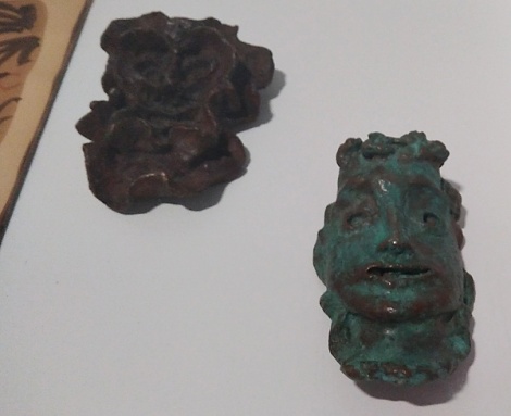
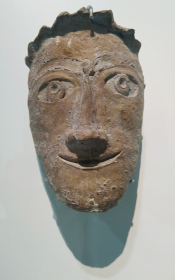
Intriguing carvings…
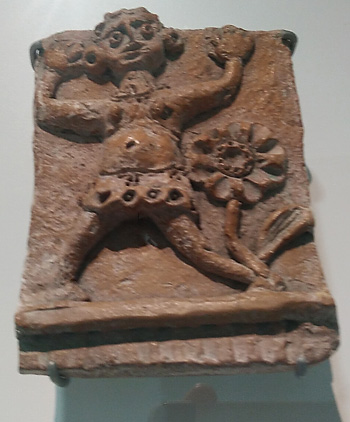
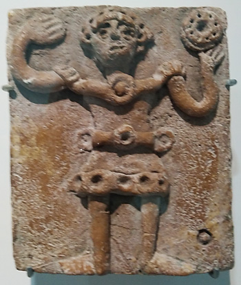
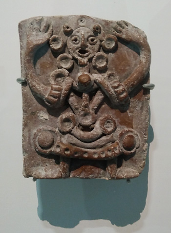
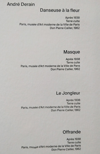
and reliefs…

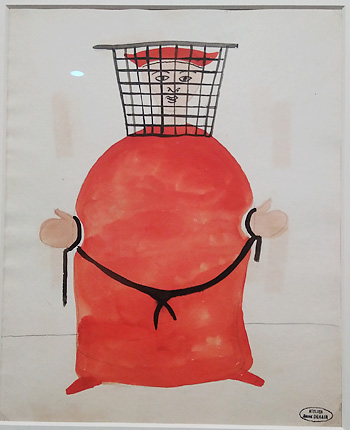
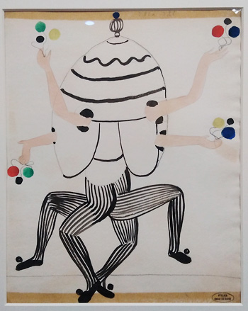
Whimsical work for the stage…

Even his stamp is arresting…the insignia of the man and the artist…HimSelf.


LACMA Treasures…California Dreaming

LACMA Treasures…California Dreaming

A Sunday visit to the Los Angeles County Museum of Art yields up varied treats for the heart, mind and soul.

WEBa“ANGER” (My husband said he loved this piece and that it reminded him of me. Hmmm…)

WEBb

A Klee beauty….WEBcUntitled“,  (1929), Paul Klee

Living for the Moment: Japanese Prints from the Barbara S. Bowman Collection

“Included are examples of rare early prints of the genre known as ukiyo-e (oo-key-o-eh, pictures of the floating world); superior works from the golden age of that art form at the end of the 18th century by Suzuki Harunobu, Kitagawa Utamaro, and Katsukawa Shunshō; and 19th-century prints by such great masters as Utagawa Hiroshige, Katsushika Hokusai, Utagawa Kuniyoshi, and others.” –http://www.lacma.org/art/exhibition/living-moment-japanese-prints-barbara-s-bowman-collection

WEBa

WEBa1

WEBa2

WEBb

Here comes  the monk….

WEBc

WEBd

A “Floating World” indeed.

Like LACMA…

“Artissima Transitiona” I

“Artissima Transitiona” I

Three years ago, for a number of reasons. my husband and I moved to Los Angeles…Santa Monica to be exact.   Since that time, I  have become involved with the making, study and teaching of artist’s books. I teach bookmaking around Santa Monica and LA County, and am continuously  evolving my own expression of this unique art form. Bookmaking, creating handmade books, unique books, artist’s books, and the book arts overlap as activities. In essence, they employ the form of The Book as an expressive vehicle.

WEBe

I have been the principal of my own decorative painting company, ArtiFactory Studio, for many years, primarily in San Francisco, where I resided, also for many years. In this post, I begin to share how I am finding ways to put these two forms together, one, bookmaking, often associated with the small-scale and intimate, and the other, decorative painting, often large-scale, which includes mural painting, glazing, faux finishing, gilding, and a myriad of other ways of “treating” the built environment, IE, the environment created by us humans as the setting for our activities.

d1

I hope to approach this subject in a series of posts, each showing a slice of what I am doing, and hope to do. I am fascinated with notions of scale, with materials, texture, space and design, as well as with the expressive, provocative,  and multidisciplinary nature of handmade books. In this post,  I will share how I brought techniques and notions specific to the field of decorative painting to the form of The Book in my own work. This process has been part of a greater transition in my life, work, business and career on all fronts.  Hence the post’s title” Artissima Transitiona“. The transition continues…

WEBa1Gilding, or the act of adhering metallic leaf over a surface adds a bit of bling, depth and dimension to an already complex surface on this handmade book cover. The gold rectangle also provides a focal point for the eye to rest on, adding order, focus and coherence to the piece. A piece of board was gilded, then added to the surface collage.

web1Texture can be a huge part of decorative painting. The artist manipulates glazes, paints and other materials over a surface to create both visual and physical texture. Here crumpled tissue paper is adhered to the surface in layers, giving it a satisfying texture, variation of color, and contrast to the look, and feel of the other materials used, which include cloth, hemp cord, beads and paper media.

WEB2The covers of this book are made of boards that have been dragged or “Striéd“, a technique by which paint or glaze is applied to a surface, and a large stiff brush is used to drag through it while it is still wet, leaving a up and down stripe-like pattern/texture.

WEB4Here a “brown paper bag” feeling is created by using humble brown wrapping paper (and bags) to create an earthy  texture on the surface of this book’s covers. Individual pieces of hemp cord are used for the binding, adding to the homespun simplicity and feel.

WEB5This book is created from boards that were originally painted with metallic paint and glaze samples for a client. I loved how these samples looked together, and added the rust, iron and verdigris sample pieces above them.  The rest of the book is made of paper with plant material flowing through it.  It  is bound with linen thread in a  single signature  (gathering of folded pages).

WEBaFinally, here is a book with an accordion spine; a “found” spine…meaning that I happened upon a design brochure, and its size, weight and color worked perfectly the book I developed. The covers are made of paper that has been textured, painted and glazed, then glued onto boards. The contrasting “edge design” is created by the addition of another painted and glazed decorative painting sample, glued on the open edge, then folded over, and glued onto the inside of each cover, giving it more stability, integrity, and visual interest.

I hope you will join me as I journey through this time of creative transition, exploration, and discovery. Although the waters feel uncharted, there are plenty of inspirational and provocative artists, makers and craftspeople to help light the way.  Here’s to diving in!

Studio Poem: Seeing the Light (if only briefly…)

Studio Poem: Seeing the Light (if only briefly…)

We develop studios…work spaces…work places…wherever we are.

Oct212012_6573

Palatial mansion (or loft), or a place within our heads.

StudioWEB4

The sunlight hit a series of samples which themselves became works.

StudioWEB2Another “sun” was created.

For a moment… I saw things in a whole new light.

StudioWEB3

Gotta hold on to that…

Oct212012_6567

Contemplating Work – Three Year Round Up

Contemplating Work – Three Year Round Up

In the spirit of the process of the necessity of the…well…updating, overhauling, revamping, refurbishing, and just re-ing the online presence of ArtiFactory Studio, and Artissima ventures….and, about to add/subtract/move around work from my site, I thought I would share some of the work completed since my last site update (yikes, was it really three years ago?), and look at some of the media, processes, forms and approaches that are part of the wide world of decorative painting.

lum2d

lum3b

I created a line of hand-painted light switch plates which I call, “Artissima Lumens“, which though small, do take a lot of work and focus to complete! Sanding the plastic or wooden surface, as well as screws/hardware, priming it, base painting it, and then…the embellishment, adornment, decoration (hmm…not a good word in art school!), whatever you want to call it. This can include hand painting images, gradating color, stenciling  a design, pattern, image or scene, adding layers of semi-transparent glaze, and most often, a combination of some, many, or even all of these!

gbr2a

4b

Mid-Century design, style, decor and imagery can be rich fodder for decorative painting on the wall, as evidenced by these bedroom accent walls. The dawn of the atomic age, coupled with star-bursts, floral imagery, and geometric shapes and patterns can be inspirational. These treatments, based on a sketch (above with mirror), made by, and a re-imagined image, (immediately above), found by the Client constitute a creative collaboration that bore Mid-C fruit in both a guest and master bedroom.

c1

a1

There is nothing quite like custom,  hand painted imagery on a wall, or ceiling.  Above, the Fightin’Irish and Michigan State logos find a home in the room of a young boy, with an avid avian interest. Custom-designed stenciled and hand-painted birds fly across his ceiling and desk wall, and perch above the entrance to his bath.

B.

D.

Stenciling, and the art of repeated pattern is an effective and beautiful way to create a border. Especially effective in a room, such as this bath, with no crown molding.  The bright color ties the room together with the strong artwork displayed there, and connects to the vibrant colors seen throughout the rest of the house.

Fleur3

Exterior  decorative painting on the wall, any wall, can go a long way towards brightening up an area that is often dark, and shrouded in fog, as many decks, patios, yards and porches are in the vast and often overcast Sunset District neighborhood of San Francisco. The painting of a colorful wall mural on the rough textured shingled siding of this deck not only brightened the area, and extended the adjoining living space to the outdoors, it also gave the inhabitants a colorful “garden” to look at through their kitchen window.  Doing dishes is going to be a lot more fun now in that house!

1cath

“MINDS HEARTS HANDS VOICES” is the motto for  Cathedral School for Boys in San Francisco. The painting of the motto so that is can be seen through the front windows communicated the basic approach and philosophy of the school. Samples of blue hues, and font styles were presented to the Headmaster and Development Director, who chose which to use. The intent was to keep the image and the message clean, clear and simple, albeit elegant, and let the words do the talking!

1hg

2hg

House numbers  for HGTV Curb Appeal, “It’s All in the Details” episode were created with customized, hand-cut stencils, based on a font chosen by the host, John Gidding. Gradated shading using highlight and shadow was added to give the illusion of depth.

ex1

ex5

The Flying Cranes project at The Briggs Residence (a historic residence in the West Adams District of Los Angeles) was the brainchild of architect Kaitlin Drisko, of Drisko Studio Architects, who wanted to transform the living room TV cabinet into a work of art . In conjunction with the Owner, and Owner’s rep Paul Davidson, designs and imagery for both the interior and exterior were developed collaboratively.  The exterior sides of the cabinet doors are gilded with composition gold leaf, or schlag metal, then painted with the cranes composition.

inb

The interior of the doors are stippled with  layers of gold, blue and red paint hues, then stenciled with a custom motif adapted especially for the project. When open, the articulated doors frame the TV screen.  The piece is designed to be a focal point in the room whether the doors are open or closed, the television on or off.

m1

It is fascinating to look back over a three year span of work, and contemplate all the uses of decorative painting.  It is a form that marries function and beauty, usefulness and aesthetics, craft, visual art, architecture and design.  Playing at once subtly and powerfully through our visual landscape, decorative painting makes its mark!

Brand New

Brand New

What is a “brand“?  I added a link to the term, because I think Wikipedia describes the concept better than I can, at least at this stage.  One of the salient words used in the definition is “identity”.  Specifically: “A brand is the identity of a specific product,  service,  or business.” My colleague  Elka Eastly Veratransformative coach and brand consultant, defines it such: “A brand is like soul DNA. It’s what people recognize you for. It’s where the “you of you” meets the world. It’s the essence of your business. “

If we look at the idea of a “brand” this way, then it could even be used to describe how we present ourselves in the world.  But that is a subject for another post….

The visual elements of color and design, pattern and image, texture, shape and composition can all be brought to bear upon  the process of developing and communicating a brand identity.  Graphic designers, like the talented Dianna Jacobsen, of Jacobsen Design, do this all the time.

As an artist, muralist, decorative painter, and colorist (not mutually exclusive terms by any means), I am always intrigued with how this works, and fascinated to participate.  We may tend to think of “brands” as purely commercial (cereal, dog food and shoes come to mind), but devoted non-profits and noble institutions also have theirs, and in my experience, a similar approach is taken to communicate them.

Let’s look at a number of  businesses and organizations who employed the painter’s brush as a tool for communicating their message, how color plays a starring role in their brand identity, and why.

When  Benihana Restaurant in Cupertino, Ca. underwent extensive remodeling,  a mural consisting of a branded graphical design was specified to be painted on the “corrugated” concrete surface approximately 10 to 80′ in the air.  Benjamin Moore Creative Paint in San Francisco matched the colors of the restaurant’s branded interior wall covering in  paint. Master color mixer and matcher Norman Chinn chose Ben Moore Aura exterior paint colors by eye. He was so precise that without knowing it, he chose the very strawberry red used as a stock color in the Benihana Restaurant brand, which is heavy on warm reds, punctuated by creams, darker reds, and red-blacks. Red tends to be associated with heat fire and blood…can we read, appetite?

Red is used in a different way in the new  Dress for Success San Francisco headquarters, designed by local architectural firm, Martinkovic Milford Architects.  Dress for Success provides business attire and training for women, and key to the design is the theme of butterflies, expressing the idea of transformation. Tone on tone reds provide warmth, accent, and a sense of womb-like support for the women getting ready to launch out into the business world.  Red’s association with life and love doesn’t hurt either.

  Blush Organic Frozen Yogurt venue in San Francisco’s South of Market District is painted is apple green and crisp white, communicating a sense of freshness appropriate to a dairy-orientated ‘snackery”.  However, this hue of green also provides other tasty associations:  the sharp and pungent flavors of limes and sour apples, as well as the sweetness of kiwis and honeydew melons.  All cool and refreshing, and fruity ingredients that could be used in their delicious yogurt!

Although also used to evoke connotations of the natural world, the greens in the  mural below, designed and executed for San Francisco’s Planning for Elders in the Central City organization serve quite a different function. “PECC”, which works to “improve the quality of life of seniors, adults with disabilities, and their caregivers in San Francisco and beyond….”  wanted to use the tree as a central image to express life, giving, renewal, community and support.  Associations with the Tree of Life, and the Giving Tree are amplified by using the color of leaves, which also represents life.  Green is also one of the colors associated with the heart chakra, standing for love, sympathy, and harmony.

Embarking on this post, I see how rich, expansive, and complex the subject of visual branding and the way artists can support it,  is.  A sister post may be in order to further elaborate on the subject. 

When we think about how everything we see, indeed everything we experience through any of our senses, communicates something, carries and provides associations, and potentially stirs our emotions, it boggles the mind, (no pun intended.)  We see, and experience first-hand just how powerful the element of color is, and how many different ways it can be used. 

We can perhaps understand in a new way, the expression, “…coloring perception…”

What experiences have You had with color branding?  Have you used color as part of a brand consultation? Color consulted with businesses, organizations, or even individuals on the how of hue  for their “soul DNA“, as Elka Eastly Vera, would say?

If so, please share it with us here.  We love to hear from You.

Remember, we are all bounding and branding through this thing called Life, together.


Niki, Too

Niki, Too

Poet and Muse

Mosaic sculpture by Niki de St. Phalle., near the entrance to the Mingei International Museum, Balboa Park, San Diego, CA

Who is the Poet, and Who is the Muse? Does the Poet hold up the Muse, or vica versa?  Both are monumental, in Niki’s eyes.

“My feet’s too big….” Not in Niki’s eyes, or hands. Certainly not in her soul.

Nikigator

Mosaic sculpture by Niki de St. Phalle., also adjacent to the  Mingei International Museum in San Diego’s Balboa Park.

The elaborate, fantastical “Nikigator” provides fun and fantasy for the young at heart. thrilling their imaginations.

Who needs a playground, when you have a Nikigator?

Too friendly to be ferocious? OR, Too ferocious to be friendly?  An easy or uneasy balance between the two?

The Nikigator is encrusted with brilliant “Niki “gems”…

…wild and fantastical designs and patterns that adorn her extravagant creatures…

And delight our souls.

What is your response to “Niki”?

If you feel so inspired, please share it with us here.  We love to hear from you.

Remember, we are all creating this thing called Life, together.

Here’s to Imagination…Creativity…DeLight….
Listen “Charlotte Talks“…all about Nikki…her daughter and granddaughter share about this wondrous being… and .prepare to be inspired!


Niki’s Magical World

Niki’s Magical World

Queen Califia, I presume?!

Niki de Saint Phalle,  French sculptor, painter, and film maker,  was an amazing and inspirational female artist  of the 20th Century.  Born Catherine-Marie-Agnès Fal de Saint Phalle on 29 October 1930, she graced our world with her presence until 21 May 2002.  She continues to grace it still through her extraordinary works which live on in parks, plazas, gardens and public spaces, free for all the world to see, enjoy and celebrate.

Please feast your eyes on these glorious, texture and color-encrusted beings, photographed in Niki’s  Queen Califia’s Magical Circle, located in the Sankey Arboretum of Kit Carson Park, in the City of Escondido, near San Diego, CA. As stated on her website, the artist drew  much of its imagery from her interpretations of early California history, myth, and legend, Native Americans and Meso-American culture and the study of indigenous plant and wildlife. Bravo, Niki!

Approaching the Magic

Entering the Magical Circle

Goddess…Totem…

Beings of  the Circle

Relating…

Interacting

Myriad of Mosaics

Magnificent use of Materials

Radiant Color

A le prochaine  Niki…  Shine on…

Have you ever seen a real “Niki”?   What does her work say to you?

If you feel so inspired, share your response with us here.  We love to hear from you.

Remember, we are all responding to this thing called Life, together.


Listen “Charlotte Talks“…all about Nikki…her daughter and granddaughter share about this wondrous being… and prepare to be inspired!


Vendor Spotlight: Jacobsen Design

Vendor Spotlight: Jacobsen Design

The word “vendor” doesn’t adequately describe the graphic design firm Jacobsen Design, and it’s principal, Dianna Jacobsen, though that she is, and they are.  No, Dianna is also artist, musician, entrepreneur, creative solopreneur, designer, and small business person and small business supporter. Her work is focused on identity design and web design for small business.

As she states the ABOUT section of her unique and eponymous website, “I grew up surrounded by art. Many of my family members are fine artists, including my father, who made a living with his paintings for many years. I suppose it was only natural that I would gravitate toward a creative way of making a living.”

Dianna understands that,To grow, your business must stand out from the competition. A cohesive, interesting, visual presentation does this: one that communicates what your company is all about and why its products or services are unique.”

And she delivers just that.  Says Jim Smith, Innkeeper, The Wine Country Inn, St. Helena, Napa Valley, California, “…Jacobsen Design has helped my business immensely. Our ‘image’ was in need of a complete overhaul and Dianna moved us from the 70s into the new century with panache and ease. From a new logo to a new brochure to new letterhead and business cards, she did it all. And she did it quickly.”

Dianna did this for my decorative painting company, ArtiFactory Studio, too, as well as creating the design for the very blog, Artissima, that you are reading right now.

ArtiFactory Studio brochure, business and postcard by Jacobsen Design

ArtiFactory Studio first homepage by Jacobsen Design

I met Dianna at the Rennaissance Entrepreneurship Center‘s Annual Fundraiser, in 2006. I knew I needed to develop my graphic business identity, and that my website needed a serious and professional overhaul.  Without missing a beat, Dianna suggested we work on a template for the site, from which would spring a logo, brochure, business card and postcard design.  With creativity, talent, skill, AND tremendous patience, she inched me forward step by step into a complete visual business identity which has  proved to be an excellent and effective way of presenting my work and services, and  has garnered oohs and ahhs from clients and colleagues alike.

While preserving the site’s format, we  have upgraded, altered, and refined its images and text, adding social media links, as well as designing and installing “Artissma, blog of ArtiFactory Studio”  in May of 2010.

Throughout, Dianna has provided expert guidance, technical skills, and graphic design wisdom, as well as tremendous generosity of spirit.  She has continually upgraded her own skills, moving adeptly through the fast-paced world of  graphic and web design and  becoming a WordPress wiz in the process. She says. “For the past few months I have been building most of my new sites in WordPress with the Genesis Framework, which allows me to design a beautiful custom website with the added functionality of WordPress. What my clients can potentially do with a WordPress site is virtually limitless – blogging, photo galleries, easy form building tools, to members only sections and even eCommerce.”.

As I testify on her site, “Dianna is flexible, responsive, creative, and informed about the ever changing options available in the digital world of graphic design. She created a very unique website template for my decorative painting business, and then created a complete identity system around that site including business card, brochure, and postcard. She understands artists, and she understands business people, and that is a winning combination for those of us doing both!
Thank you, Dianna / Jacobsen Design! Please take a moment to check out her site, and visit Jacobsen Design on Facebook, Twitter, and LinkedIn to learn more about her amazing work, and design servicesYou’ll have fun!

Do you have a favorite vendor, associate colleague or business partner that you would like to spotlight?

If  you feel so inspired,  please celebrate them here.  We love to hear from you.  Remember, we are all creating our way through this Life, together.


Featured Work: A Niche Greater then the Sum of its Parts

Featured Work: A Niche Greater then the Sum of its Parts

The Free Merriam-Webster Dictionary defines “niche” as:

  • a recess in a wall especially for a statue b: something (as a sheltered or private space) that resembles a recess in a wall
  • a place, employment, status, or activity for which a person or thing is best fitted
  • a habitat supplying the factors necessary for the existence of an organism or species
  • the ecological role of an organism in a community especially in regard to food consumption
  • a specialized market

What is the connective tissue between the various definitions above? It seems to me that the term “niche” indicates a unique space specific to an individual, species or thing.

Those of us in the fields of decorative painting, carpentry, wood working, design, architecture and building most likely have designed, created, built, painted or adorned a niche or two at one point or another.

Those of us in our own businesses, entrepreneurs, solopreneurs, creative-preneurs, creators, and those of us training, schooling, learning, job-searching,  job creating , or job holding,  have at least one thing in common: we want, need, or are compelled to “find our niche“, our “place” in our respective fields, professions, markets, companies, schools, programs, jobs, or careers. We are moved to find that  elusive (and sometimes colorful!)  unique space which seems to defines us authentically,  in our worlds of work, family, society, and community.

Abby Kerr, copywriter,  blogger, niche marketer, and owner of Abby Kerr Ink says of her work: “It’s about nichifying your offerings to meet your right people right where they are.” .  Within the “niche” business model, the proposition of uniqueness in gifts, talents, voice, sensibilities, skills, and offerings would seem to be a given.

So it is with Clients, who wish to express themselves by making something even more unique of their architectural niche space, at home.

Beloved Clients of mine purchased a “dream” retirement home…well, a house they planned to transform with color, design, furnishings, and decorative painting INTO their dream home, with the skilled assistance of various vendors.

Their realtor suggested a mural application for the hitherto unadorned wine bar niche, and the game was on!

Niche before "niche-y" adornment

My Clients had spent decades living in Southern California, and were enchanted by the Sonoma Wine Country in which their new house was situated.  They were  thrilled about making the Wine Country a theme in their new home.

We chatted about vineyard scenes, and determined we didn’t want a “prototypical” one.  We looked at photos, colors, applications and mock-ups.  We determined that a softly rendered scene of lines of vines gently receding to meet misty hills under a golden sky would be best.  I applied the mural with semi-transparent washes of glaze, as opposed to opaque paints, (an unusual approach) to the back wall of the niche, and glazed its side walls and ceiling in layers of red wine-y colors.  Involved with the whole process from start to finish, my Clients were delighted with the outcome. which reflected THEM, and the unique place they were at in their lives, right at that moment.

"Niche-y" adornment reflects Them

The entire wall into which the “niche-y” Wine Bar niche was placed was treated in concert with its “niche-y” focal point, the Vineyard mural.  The walls were painted a strong red, mitigated by an application of three deeper  red “wine-y” hued glazes applied simultaneously.  An original “adage” penned by the Clients was lettered in “grapey” purple, and sparkling metallic colors.  The built-in cabinetry and bottle storage were base painted and wood grained (treated with “faux bois”) in tones of “sweet rosy brown” , which worked beautifully with the bar’s countertop.

The Niche is part of the Whole

My Clients were pleased with a result which reflected Them, and their unique take on where they felt themselves to be, right at that moment.  The process of developing a “niche-y” design of artful applications in their Wine Bar niche, and throughout their new home during a time of transition helped them through that transition, and eased their way into a new phase of life. You might say that they “niched” their new home to reflect the people they had become, and created a “niche” of the entire house which would  support them in their adaptation to retirement, containing and expressing both the effects of their “old” life, and expressing their excitement about the new.

In this way, “nich-ing” can not only become an expression of our deepest selves, our uniqueness, offerings and worth, it can also help us to embrace our lives and experiences as they are now, and move more confidently, and happily, into the future.

When have you used your art or craft to create or enhance a niche, for yourself, or for others?  What was the quality of the process and its outcome?  If you feel so inspired, please share your unique, “niche-y” experience with us. We love to hear from you. Remember, we are all  in this thing called Life, together.