Brand New
What is a “brand“? I added a link to the term, because I think Wikipedia describes the concept better than I can, at least at this stage. One of the salient words used in the definition is “identity”. Specifically: “A brand is the identity of a specific product, service, or business.” My colleague Elka Eastly Vera, transformative coach and brand consultant, defines it such: “A brand is like soul DNA. It’s what people recognize you for. It’s where the “you of you” meets the world. It’s the essence of your business. “

If we look at the idea of a “brand” this way, then it could even be used to describe how we present ourselves in the world. But that is a subject for another post….
The visual elements of color and design, pattern and image, texture, shape and composition can all be brought to bear upon the process of developing and communicating a brand identity. Graphic designers, like the talented Dianna Jacobsen, of Jacobsen Design, do this all the time.

As an artist, muralist, decorative painter, and colorist (not mutually exclusive terms by any means), I am always intrigued with how this works, and fascinated to participate. We may tend to think of “brands” as purely commercial (cereal, dog food and shoes come to mind), but devoted non-profits and noble institutions also have theirs, and in my experience, a similar approach is taken to communicate them.
Let’s look at a number of businesses and organizations who employed the painter’s brush as a tool for communicating their message, how color plays a starring role in their brand identity, and why.

When Benihana Restaurant in Cupertino, Ca. underwent extensive remodeling, a mural consisting of a branded graphical design was specified to be painted on the “corrugated” concrete surface approximately 10 to 80′ in the air. Benjamin Moore Creative Paint in San Francisco matched the colors of the restaurant’s branded interior wall covering in paint. Master color mixer and matcher Norman Chinn chose Ben Moore Aura exterior paint colors by eye. He was so precise that without knowing it, he chose the very strawberry red used as a stock color in the Benihana Restaurant brand, which is heavy on warm reds, punctuated by creams, darker reds, and red-blacks. Red tends to be associated with heat fire and blood…can we read, appetite?

Red is used in a different way in the new Dress for Success San Francisco headquarters, designed by local architectural firm, Martinkovic Milford Architects. Dress for Success provides business attire and training for women, and key to the design is the theme of butterflies, expressing the idea of transformation. Tone on tone reds provide warmth, accent, and a sense of womb-like support for the women getting ready to launch out into the business world. Red’s association with life and love doesn’t hurt either.

Blush Organic Frozen Yogurt venue in San Francisco’s South of Market District is painted is apple green and crisp white, communicating a sense of freshness appropriate to a dairy-orientated ‘snackery”. However, this hue of green also provides other tasty associations: the sharp and pungent flavors of limes and sour apples, as well as the sweetness of kiwis and honeydew melons. All cool and refreshing, and fruity ingredients that could be used in their delicious yogurt!

Although also used to evoke connotations of the natural world, the greens in the mural below, designed and executed for San Francisco’s Planning for Elders in the Central City organization serve quite a different function. “PECC”, which works to “improve the quality of life of seniors, adults with disabilities, and their caregivers in San Francisco and beyond….” wanted to use the tree as a central image to express life, giving, renewal, community and support. Associations with the Tree of Life, and the Giving Tree are amplified by using the color of leaves, which also represents life. Green is also one of the colors associated with the heart chakra, standing for love, sympathy, and harmony.

Embarking on this post, I see how rich, expansive, and complex the subject of visual branding and the way artists can support it, is. A sister post may be in order to further elaborate on the subject.
When we think about how everything we see, indeed everything we experience through any of our senses, communicates something, carries and provides associations, and potentially stirs our emotions, it boggles the mind, (no pun intended.) We see, and experience first-hand just how powerful the element of color is, and how many different ways it can be used.
We can perhaps understand in a new way, the expression, “…coloring perception…”
What experiences have You had with color branding? Have you used color as part of a brand consultation? Color consulted with businesses, organizations, or even individuals on the how of hue for their “soul DNA“, as Elka Eastly Vera, would say?
If so, please share it with us here. We love to hear from You.
Remember, we are all bounding and branding through this thing called Life, together.
 Strong paintings…
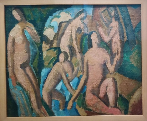
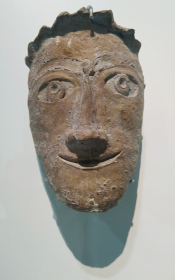
 Muscular portraits…
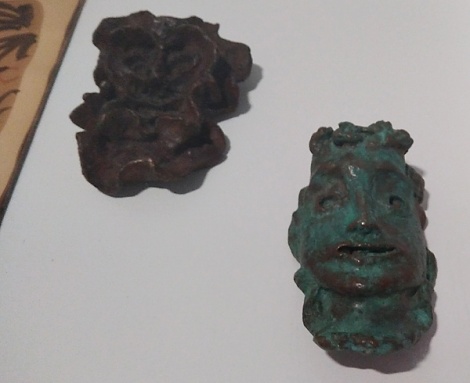
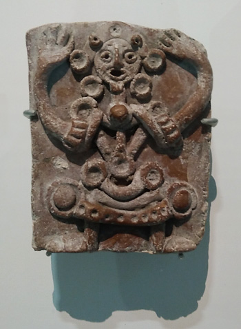
 Intriguing carvings…
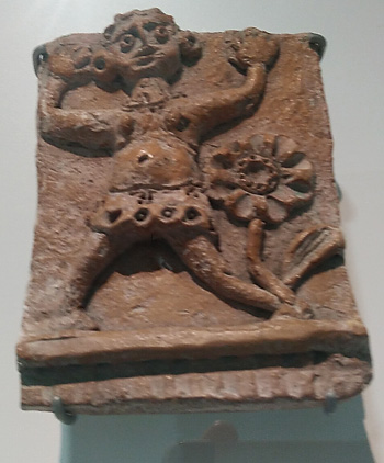
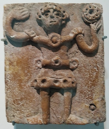
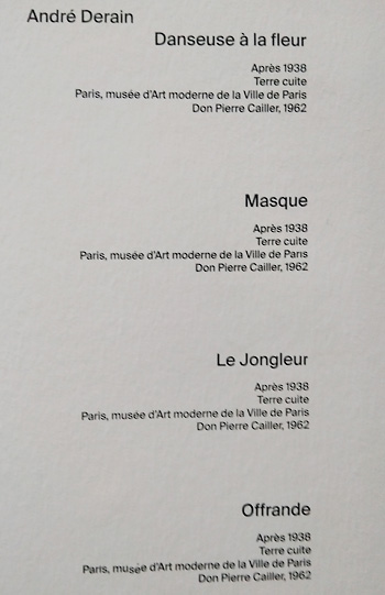 and reliefs…
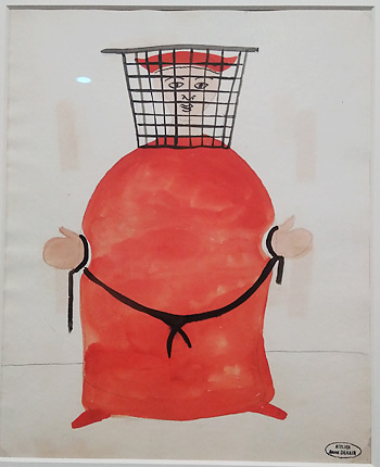
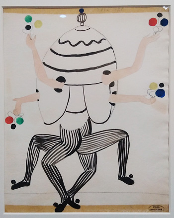 Whimsical work for the stage…
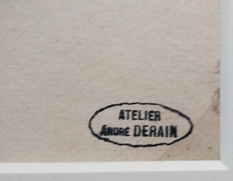
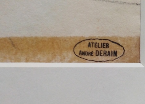 Even his stamp is arresting…the insignia of the man and the artist…HimSelf.


