“We Right The Book” IV

“We Right The Book” IV
Making Scrolls…The Book That Rolls…

I am honored to serve as Artist in Residence at Verdugo Hill High School in Tujunga,  CA (Los Angeles) for a group of 42 Senior English class Visual and Performing Arts (VAPA) students.

Our project is entitled, “We Right the Book“, and is supported by an Artist in residence grant from the City of Los Angeles Department of Cultural Affairs.  I am working with the students on a series of bookmaking projects during weekly workshops held right in the classroom from September – December, 2017. The students are also assisting with bookmaking workshops held for the community at-large in the Sunland-Tujunga Branch of the Los Angeles Public Library.

The project is designed to offer participating students an outlet for feelings, thoughts, hopes and dreams related to their upcoming transition out of high school, and into the next epoch of their lives.

We started with the basics: Accordion Fold Books, created from folding equidistant sections of material.    We moved from there to the fun, kinetic and versatile Flag Book Structure, then on to theatre-like Tunnel Books.

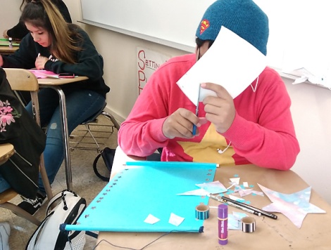
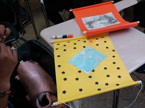
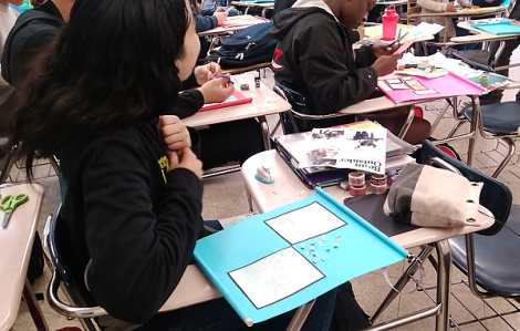
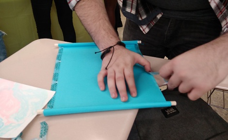
To change it up, we then created scrolls…the ancient, original portable (as opposed to stories written on cave walls…) books and rolled either horizontally or vertically. We attached bright tagboard sheets to wooden dowels, marbleized our own paper and used it, as well as other collage materials, rubber stamping, hole punched designs and more to our pieces. The results were….beautiful.
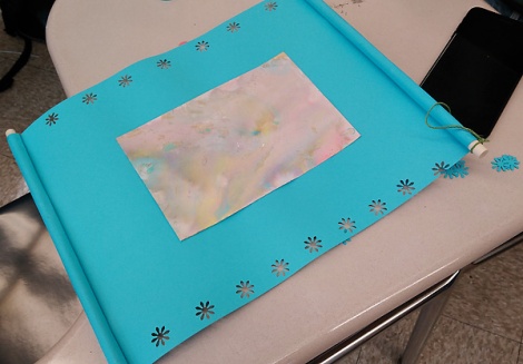
Summer dreaming?

Focussed, and private.

She punched out the star shapes from black paper, and glued them on…and it looks like we are seeing through to the night sky…
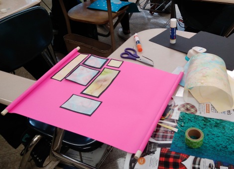
Beautiful use of framing the marbled paper…
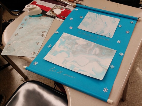
“Winter Wonderland”…no matter that we are in Southern California…imagination rules!
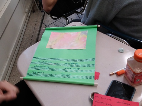
“Never stop doing what you love….”

Another use of black framing…

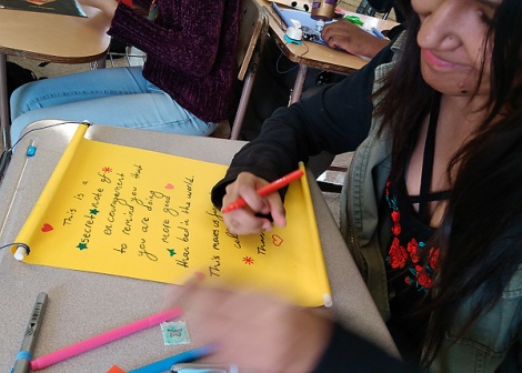
This is the secret note of encouragement...”   what an inspiring proclamation…

This is what it is all about.
“Building Your World”

“Building Your World”

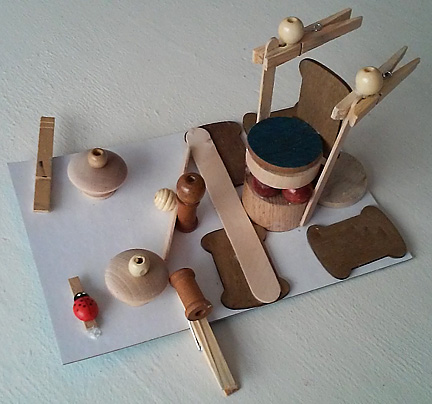
In a recent program at the Westwood Branch Library, children created their own worlds inspired by architecture, repurposed materials, and their own imaginations!

Participants engaged concepts of architecture, design, engineering, construction and environment, finding new uses for cast-off items, and recycling what could have been trash into  fanciful constructions of joy, wit, whimsy…and always, creativity.

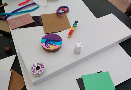
Creating and using color…pipe cleaners, a wooden clothes pin, plastic and paint samples and cardboard ribbon spools!

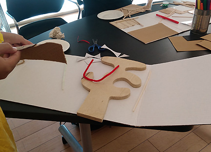
Arranging a wooden cutout (left over from a furniture-making class) and a pipe cleaner on a project board…ready to add other materials.

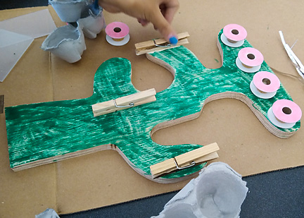
Another young maker using the same wooden cutout in a whole different way. Clothespins and empty spools become hooks and clips for jewelry.
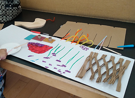
Drawing combined with unique packing material and plastic tiles topped by small spools form the visual structure for this young boy’s world.
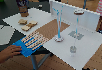
Here the project board is used as a flat base, and din=mension is added with a gift box top, straws, and yet another employment of empty spools.
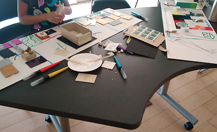
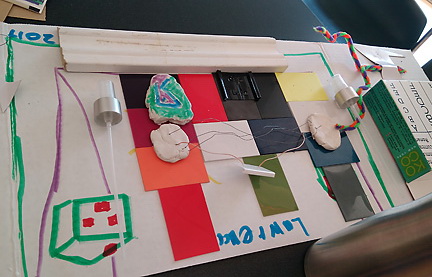
Participants worked flat on tables in the library’s multipurpose/community room, and most came at the start of the program, and stayed for its 1.5 hour entirety, allowing them time to truly play, design, experiment and build.

Lawrence worked what looked to be upside down on his project,
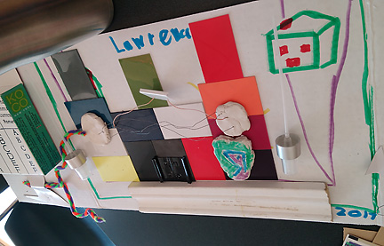
perhaps turning his project board base around to see how it was developing from both vantage points.
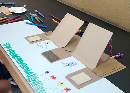
This lovely world of color, flowers animals and doors/flaps which lift up was created by a young girl of preschool age, working quietly in a corner with her mother. She made beautiful use of the materials, arranging cardboard, tile and paint samples and pipe cleaners to beautiful effect.  I would love to visit this world for a bit!

It was exciting to see children visualize wolds in real time, then create them concretely. I have to believe it was wonderful and empowering for the children and their adults as well.

To Build a World…Inspired by Louise Nevelson

To Build a World…Inspired by Louise Nevelson

WEB1What a wonderful experience to introduce young artists to the wondrous wood work of the artist Louise Nevelson…and what better way than for them to create their own (mini) wood sculptures!

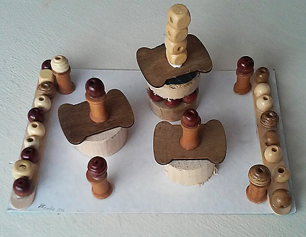
WEBaWorking on simple cardboard bases, students worked with an assortment of new and repurposed wood objects, in a variety of shapes, thicknesses and sizes.

WEBbPlaying with shape, space, form, pattern, dimension and design, they arranged their chosen pieces into sculptures (“built environments”), and secured them  using “tacky glue“.

WEBcSome used aspects of symmetry to create harmony and balance.

WEBddSome built their pieces up,

WEBfinto elegant and contained structures,

WEBhsome out, into strong, repeating patterns,

WEBeand some built up and out producing a magical sense of movement that is a joy to behold.

WEBgThey used the color, texture and utility of the materials to establish strong compositions, sustain visual interest

WEbiand just plain have fun!

It was beautiful to see them build….their worlds.

Gratis Louise Nevelson.

Behind the Mask 2

Behind the Mask 2

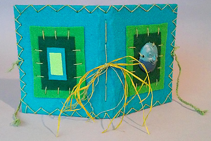
It has been fun integrating my Mom, Judy Disman’s “mini-masks” into a series of my handmade books.

WEB2The series is comprised of small (approximately 4.5 x 6 x1-1.5″), single and multiple signature books,

WEB6made of repurposed board, paper, jewelry parts, and raffia,

WEB1as well as hemp cord, linen thread, and Eco-fi felt (made of recycled plastic bottles.)

WEB3The stitched, or “lashed” edges are inspired by

WEB4medieval clothing and lacing, and of course…color.

WEB5The books tie together, and the pages are blank…

all the better of stashing secrets!


Behind the Mask 1

Behind the Mask 1

It has been fun integrating my Mom, Judy Disman’s “mini-masks” into a series of my handmade books.

WEB3The series is comprised of small (approximately 4.5 x 6 x1-1.5″), single and multiple signature books,

WEB5made of repurposed board, paper, jewelry parts, and raffia,

WEB1as well as hemp cord, linen thread, and Eco-fi felt (made of recycled plastic bottles.)

WEB6The bound edges are inspired by

WEB7medieval clothing and lacing,

WEBaand of course…color.

The books tie together, and the pages are blank…all the better of stashing secrets!

Architectural Gem Series 1

Architectural Gem Series 1

Santa Monica Self-Styled Eclectic

Aug252015_1491

WEB4

WEB5

WEB1

WEB7

WEB8


Piecing Our Story

Piecing Our Story

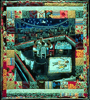
FAITH_art2Faith Ringgold

Inspired by the “Story Quilts” of Faith Ringgold…I incorporated fabric collages into some classes and programs I  had the privilege of  teaching and leading.

WEB1The idea was to piece together elements of fabric…cloth…to express or depict aspects  of the maker’s life story. To “fabricate’ one’s story…to “cloth” one’s story in visual details…the definition can be rather loose.  Above, my sample expresses something of house and home…a broad theme that could encompass almost anything.

WEB1This fun and evocative piece created by a 17 year old makes beautiful use of aqua-blue wool…at least I think it is wool. As I get many of supplies at a place called “Trash for Teaching” , where companies’ left-overs or overstock is donated to be resold to teachers and others at very low cost,  I am not always sure of their origin. This artist did use paper for the face…extrapolating from a previous lesson on how to draw the face in proper proportion. She is also interested in becoming a make-up professional, so this piece may have played into that ambition and interest as well.

WEB2_2Totally different, but just as evocative is this piece that functions almost like a banner, celebrating the maker’s daughter. Balanced through the elements of color, shape and composition,  the use of the symbols of heart and arrow are  arranged to create the strong center of a radial design which continues and expands the motif of the arrow.  Arrow pointing to directly the heart? Seems like a rather clear story there.

WEB5These brilliantly colored feathers almost appear to emit light against the dark background.  Arranged in a repeating color pattern, the artist is careful to begin and end with pink,  containing the composition within that color horizontally, while flanking it vertically with luminous green, and thus employing the tension of opposites. Pink is a permutation of red, “light” red, (red plus white) which is the compliment, or opposite of green. The color story expresses the human story as a whole.

WEB3Two uses of the heart motif, one created through stitching, and another through the cutting and gluing of material define these two pieces.  Both hearts are tilted to the left, which gives them a dynamic feel of being on movement, and which in turn adds movement to the composition. Above  the deceptively simple composition of white and red on black belies the powerful associations of those colors. Below, warm hues of the  cool color of blue are offset by the soft pinkish-purple (which contains blue) in the center of the color scheme.  The piece is further enlivened by sharp dashes of back in the corners which radiate outwards, and black letters in the center set off by white, another system of opposites.

WEB4The use of the heart shape / symbol, as a central motif, the combination of different kinds of cloth/textile/fabric media, and employment of framing as a compositional device characterize the works above. Bows, pom poms, a scattering of smaller hearts and butterflies, and imaginative color choices are all at play, adding a layer of magic and whimsey to the feelings of hope and longing expressed in these pieces.

Web1AA Mom of two created this piece, which depicts her two children who also attended. Although she came in towards the end of the project, she was able to put together vibrant colors, and strong shapes which speak volumes about her commitment to her family, and tell at least a piece of her story. One strip of patterned ribbon is added which reflects the flowers, and ties the composition together by adding complexity and interest right in the center of the piece. This artist was very specific about which  ribbon she was going to use to achieve this, and with good reason, as the results are stunning.


Material Girl 3: Many Parts Create The Whole

Material Girl 3: Many Parts Create The Whole…FLAG BOOKS!

WEBc

The fun and innovative Flag Book  structure can be a powerful  form to express thought, feeling and idea through word and image.

WEBm

Within the flag book…there can be a

WEBo7

We all know that…

WEBnWEBn1

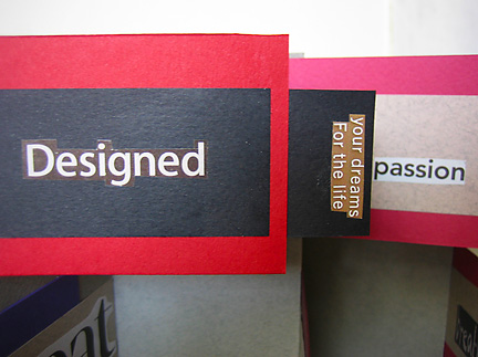
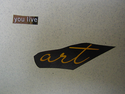
Above are Flag Book front and back covers..with a “found writing” title..which employs  text,  color, the font/typeface, the design, composition, and space between the words for cognitive and emotional impact.

WEBn2A single word or phrase can pack the proverbial punch, when paired with color and placement.

WEBn3Putting together “found” words and phrases can yield unexpected poetry…the poetic power of  Found Writing.

Found Writing can help us define our vision (or one of them…)

WEBoWEBo2and give us a hitherto unknown directive of sorts.  We  find that we can advise ourselves…

WEBo4within the context of numerous ideas.

WEBo9The layering of words, colors, shapes and text

WEBo3creates new meanings,

WEBpand may tell us something important…

WEBp3about something we want,

WEBp2or need

WEBp6to know…

WEBp5or experience…

WEBp1or try….

WEBp7You may find that you make a promise…to yourself…

WEBp8That must be kept.

Something new…has been born.

Wave those flags!!!!

WEBl


Material Girl 2: Many Parts Create The Whole


Material Girl 2: Many Parts Create The Whole

WEbj1

Preparing for bookmaking programs at the West Hollywood Library, the Diamond Bar Library, the Fairview Library, and the Montana Avenue Library isn’t just a labor of love…it can be pure joy.

WEbaWEbbThe spread of papers of just the right thickness, ready to be folded into the versatile accordion/concertina spine.

WEbc1Pages are attached to each fold of the spine. More folds = more page possibilities!

WEbe1A rainbow of front and back covers cut to the same height as the spines.

WEbe3Mottled” book pages.

WEbdHigh contrast, and “grey on grey” spine-cover color designs. The effect can be elegant!

WEbgWEbg2The glory of your basic colored construction paper…not just for kids.

WEbfAssorted papers…Japanese patterns, parchment, and ‘plain brown wrapper” card stock. Variety is the spice of life…and bookmaking!

WEbf1Let’s take a closer look at those papers!  Now…what can we do with them?

WEBmFront cover design…

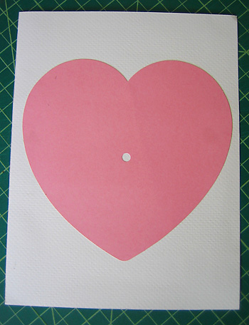
WEBm1Use of paper heart found at “Trash for Teaching” in Los Angeles, on inside front cover.

WEBm2“Fan” page designs! The pages will be attached to each fold of the spine, and will “fan” out when the book is opened by pulling the back and front covers away from each other.  The “fan” book can also be opened ‘traditionally”,by turning the cover, and moving through the pages by turning them consecutively.

WEbiPutting it all together….a family theme.

WEbi1“Doors” and Windows” can be cut in pages and covers, to reveal the unexpected beneath and behind!

WEbj“Fan” pages are attached to the accordion /concertina spine, seen here in a variety of colors.

WEBkWEBk1WEBk2 WEBk3“Heart” openings on the “fan” pages  (“Windows/Doors”) reveal surprises behind and beneath…which can deepen and expand the theme of the book.

WEBl1WEBlCardboard shapes, another treasure found at Trash for Teaching, create a slight three-dimensional (“relief“) effect, and can be used to create visual frames for photos or other treasures added to the book.

WEBo6

Don’t we all?!!

Secondary Colors are Primary Too

Secondary Colors are Primary Too

After posting last week about the Primary Colors (in the paint, print,  dye sense…as opposed to the “light” sense)…I had to give some color time to those marvelous combos of primary colors…the ever-loving, and equally important secondaries!

Web1Purple = Red + Blue

Web2Green= Blue + Yellow

Web3Orange = Yellow + Red

Color WheelInterestingly…the complimentary colors are comprised of colors that are directly opposite, or across from each other on the color wheel.  They are diametrically opposed…complete opposites. These dramatic duets are composed of the pairing of one primary color, and one secondary.  Since each secondary is composed of two primaries, complimentary pairs contain all three primaries between them, and effectually “cancel out” each other’s color properties (I.E.- “neutralize” each other), when mixed.

Web7On the contrary, when placed next or in proximity to each other, secondaries can create brilliant, arresting, and “can’t get enough of it’ color palettes. Seeing Green, orange and purple all together, adding brightness to a house exterior, well, it just wakes up your senses, ready or not!

Web5Purple and orange share a red “parent” color in common. The other two primaries, blue and yellow, are expressed within them as their other color “parents”. That brilliant, hot orange packs the proverbial palette punch as an unexpected accent and frame to the softer purple house body color.

Web6Here we have a pale orange (salmon), with a teal green, punctuated by bright purple flowers. Without the exuberant purple blooms nestled amongst their own green leaves, this exterior color palette might descend into the realm of the ho-hum.

Web8Orange (here with a rosy glow) and green share yellow as one half of each of their wholes.  It is almost impossible for yellow not to add warmth, relating, as it does, to the radiance and heat of the sun. The palette here is integrated with the green leaves of the foliage, which makes the warm rosy orange stand out all the more.

Have You designed solely with secondaries?  What have You come up with?  Working with secondaries, which express, but indirectly, the primaries they contain within them, can create strong, edgy color designs.  Perhaps not for the faint of color heart, but guaranteed to move your blood. A powerful way to tell a color story.