Color: A Balancing Act 2
What is the “emotional loading of a space”?
Says Helen Gurura, an internationally accredited colour design consultant, and executive vice-president of the International Association of Color Consultants (IACC). “Feelings can be evoked through colour at even an unconscious level and this gives rise to the term “colour emotion”, defined as “an associated feeling or emotion induced in the brain during the colour perception process”. In architectural psychology terminology this is called “the emotional loading of a space”. Achieving balance in colour design clearly remains a challenge though.”
 French Cafe..anyone?
In last week’s post, we looked at a variety of exterior architectural color schemes through the lens of visual “unity” and “complexity”, exploring what creates both over and under-stimulation, and ways of creating balance between these extremes. The goal is to avoid both extreme unity/monotony/sensory deprivation which results in under-stimulation, and extreme complexity/variety which can over-stimulate the senses. As Ms. Gurura states, “The balance between unity and complexity is the first and most important rule in the design of user-supportive architectural environments.”
Essentially, we expect, and I extrapolate from this want and need our senses to be moderately stimulated at all times. I must assume that dreaming accomplishes this when sleeping…even when mediating, we are often instructed to concentrate on the breath, a sensory experience.
The built environment is a place where we may posit our dreams, our imaginations, even our breath. When we have been “doing battle”, even if that means fighting the good fight, out there in the world, we may need our homes to return to, relax, recharge, regroup and catch our breath in.
Let’s relax now, take a deep breath, and enjoy looking at some interiors that were designed through placement of color, pattern, texture, and more, to not only meet the functional needs and wants of those who live and breath there, but also to express their innermost hopes, dreams, wishes and desires…and perhaps even fantasies about themselves and their lives.

The owner of a charming home in Berkeley, Ca, wanted to transform his son’s old bedroom into a guest room, that his fiance would claim as her own special space in the house. His love of strong color, bold artwork, rich, layered patterns and textures is mitigated to accommodate her taste for beige by the choice of a neutral wall color and creamy trim.

The wall color is taken to the bookcases, which frame not only scores of colorful books, but also his son’s powerful painting. By keeping the bookcases “color neutral”, what is contained within and between them is kept front and center, and the multitude of colors and patterns do not overwhelm.

Warmth, richness, depth,and elegance reign in this master bedroom, where the deep earthy golden-brown-with hints of persimmon wall color compliments the multi-hued wood floor, the heavy dark wood furniture, and fresh white trim. The trim is needed to relieve the strength of the other colors, and because the room is spacious, filled with strong lines and architectural details, and large pieces.
 –
–
Although this room doesn’t have the plethora of color, pattern and texture in its details like the Berkeley guest room above, the complexity of its space, containing recesses, alcoves and a window seat, the variance in the texture and light reflectance of its surfaces, and the expanse of textiles on bed and chair, give it just as much visual variety and interest. The room is beautifully balanced and filled with light, comfort and calm, with enough accent to engage the senses.

Here again pale “neutral” (read, “beige” ) walls and tile, and white ceiling contain, frame and unify strong color and bursts of pattern, just as the streamlined silver frames contain but do not restrain the beautiful, bright watercolor paintings created by the owners’ children. The effect of the paintings and blue-patterned vase is amplified by their reflection in the mirror, which adds a sense of space to a smaller room. The varying colors and patterns are also on different planes: the paintings on the wall parallel to our line of sight, the counter top perpendicular to it, the vase parallel, but below the paintings, creating a layered effect, adding complexity and variety to the space.

 The serenity of this bedroom is achieved not only with soothing neutrals on wall and ceiling, but carrying that over into large swathes of textiles such as the bedspread, pillows and throw. Layers of texture and intricacy are created through the “distressed” mirror frame which adds a painted and reflected scene to the visual mix, and intricately detailed and tasseled window treatment which adds sheen, pattern, and a whole other level of visual interest, as well as framing the window. Who couldn’t relax in this room? R & R is exactly what it is for…and as unbroken as possible. As opposed to…

the “boudoir”, in the same unit! This room will keep you awake, though it does share the element of faux fur pillows with the bedroom. Needless to say, the owners are style Franophiles, at least with this space, which is a second dwelling for them, an urban “get-away” from their home in Napa County, CA. In this alcove, they had big fun “papering’ the walls with a fabulous, French-feeling fabric, placing a gold “sunburst” above the divan ( covered in the same pattern), and “peppering” it with black fur pillows. Isn’t it wonderful to have a room where you can just go wild with the design and decor? Shouldn’t we all have that? This room is just a little jewel box of color and pattern, and we found exactly the right paint color for the ceiling, to pull out the rich cream hue in the fabric, and soften the pinky-red surrounding it. Because the fabric is so all-encompassing, the walls, curtain, divan and pillows covered in it merge into one, and the complexity and visual variety is contained in that one pattern. The room is small, the room is warm, the room is happy, and the room sings…a totally different song then the bedroom, and another example of “securing unity in the midst of variety….”, and achieving balance, as Helen Gurura would say!
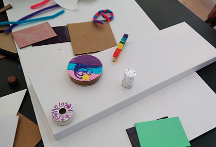 Creating and using color…pipe cleaners, a wooden clothes pin, plastic and paint samples and cardboard ribbon spools!
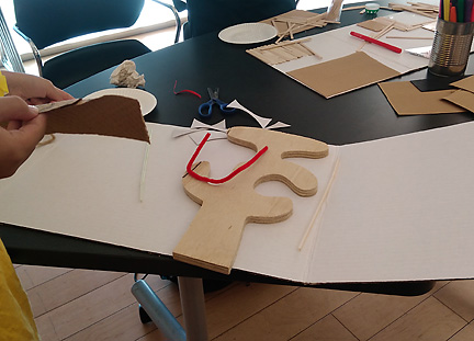 Arranging a wooden cutout (left over from a furniture-making class) and a pipe cleaner on a project board…ready to add other materials.
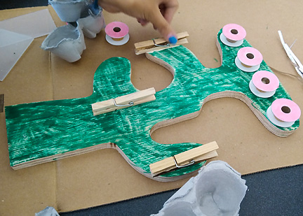 Another young maker using the same wooden cutout in a whole different way. Clothespins and empty spools become hooks and clips for jewelry.
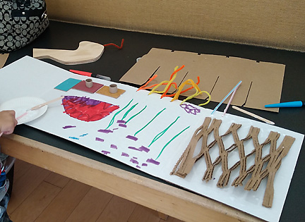 Drawing combined with unique packing material and plastic tiles topped by small spools form the visual structure for this young boy’s world.
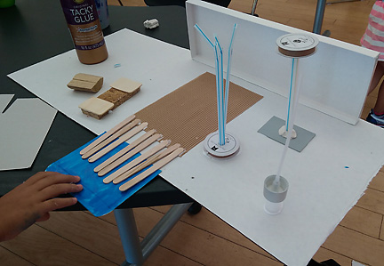 Here the project board is used as a flat base, and din=mension is added with a gift box top, straws, and yet another employment of empty spools.
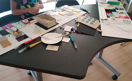
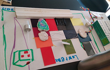 Lawrence worked what looked to be upside down on his project,
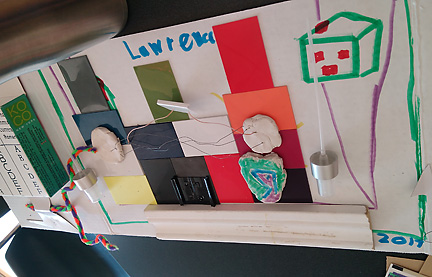 perhaps turning his project board base around to see how it was developing from both vantage points.
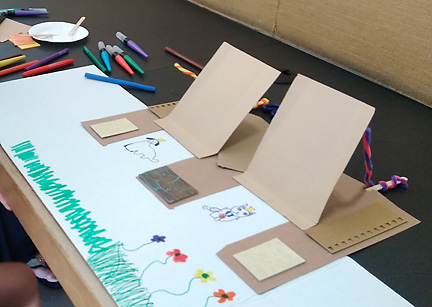 This lovely world of color, flowers animals and doors/flaps which lift up was created by a young girl of preschool age, working quietly in a corner with her mother. She made beautiful use of the materials, arranging cardboard, tile and paint samples and pipe cleaners to beautiful effect. I would love to visit this world for a bit!


 –
–


