The Faces of France: Provence

The Faces of France: Provence

On an earlier trip to Paris, my husband Mark (Marc Henri when we are in France…) said to me, “After awhile, I felt like I was just a giant eyeball, an eyeball on two legs, just trying to take everything in…

I have long been fascinated by the multitude of incredible carvings gracing walls, doors, window frames, and all manner of architectural details, constructs and aspects…and especially, the carving of faces, grimacing, glaring, laughing, smiling and  otherwise gazing sternly, mischievously or fondly, out to the populous.  here are some from beautiful Provence…in the South of France.

High up on the chapel dome of Forcalquier Cathedral.

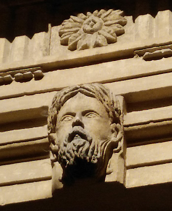
In Forcalquier, above an imposing wooden door.

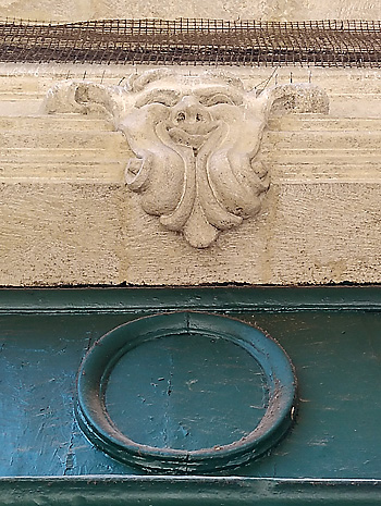
Above a door  in Aix-en-Provence between two famous figures carved into the stone surround.

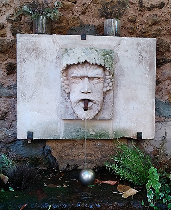
Fountain in Aix-en-Provence

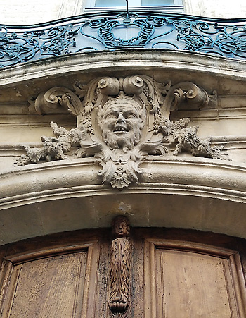
Note the small carved figure below the laughing face resting in stoney foliage in Avignon.

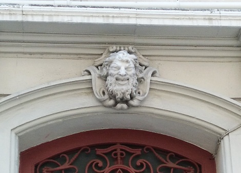
I imagine these creatures, seen above doors in Avignon, as having fabled, pagan origins…they look like Pan or one of his relatives.

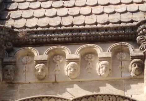
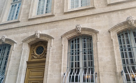
The patricians of Avignon? Kings and Queens? Whoever they are, these male and female visages preside over Avignon‘s doors and windows with aplomb.

Do these mysterious carvings and images hint at at Europe’s pagan past? Greek and Roman Gods and Goddesses? Mythology? The royalty of France?  Whatever  and whoever they are, they never cease to intrigue, fascinate, and amaze.

Next up,  “des animaux”, the fantastical beasts, creatures, gargoyles and imaginary beings that haunt cathedrals, fountains, statuary and even the tapestries of France.

Stay tuned!


The Faces of France: The Cluny and around Paris

The Faces of France: The Cluny and Around Paris

Ferocious door handle holders…Devourers? Paris

On an earlier trip to Paris, my husband Mark (Marc Henri when we are in France…) said to me, “After awhile, I felt like I was just a giant eyeball, an eyeball on two legs, just trying to take everything in…

And Paris, or much of it, and la belle France, or much of it, is indeed as Hemingway so aptly said, “…a moveable feast.

A glorious feast for all the senses, but, especially “pour les yeux” …for the eyes  One of my favorite aspects of this are all the carved faces which are everywhere…adorning the interiors and exteriors of building, playing sentinel over doorways, emerging out of ceilings corners, festooning roofs,  animating churches, and gazing down upon us the viewer and the passerby as if to bless us with a Latin benediction or perhaps curse us with an ancient pagan epithet.

Upside down and all around. Faces and figures whether human, animal or fantastical, often come in pairs. Musée de Cluny, musée national du Moyen Âge. (The Cluny Museum, National Museum of the Middle Ages),  Paris

“Here’s lookin’ at you, kid”. Carved wooden pew…decoration/embellishment…Musée de Cluny, musée national du Moyen Âge. (The Cluny Museum, National Museum of the Middle Ages),  Paris

Gazing upon each other…with angels in the background. Musée de Cluny, musée national du Moyen Âge. (The Cluny Museum, National Museum of the Middle Ages),  Paris

Back on the Paris streets…carved faces gaze down upon windows, architectural supports, and doors.

In context…and glorious repetition of detail…filling space in a beautiful and visually arresting way.

King and Queen? Master and Mistress? Preside. Paris.

In context, gazing out solemnly, as if wearing a mantle of responsibility.  Paris.

Hard to leave this magnificent city…but glad it is guarded by so many watchful eyes.

Paris, you are forever. I think if you go, we go too.

Live on, for we love you, and will guard you as assiduously in our hearts as your  silent sentinels do on your walls, roofs, doors and ramparts.


Siting Santa Monica: The Door I

Siting Santa Monica: The Door I

WEBfA beautiful old door, touched by time…discovered on a walk in Santa Monica.

WEBgAdorned with peeling layers of paint,

WEBcand metal details,

WEBathe doors swing open beneath foliage, elaborate carving, and a lantern-like light fixture.

WEBdThere is the sense of time gone by,

WEBeand the entrance into a magical world.

WEBfWho knows what is on the other side?  Lives being lived, no doubt.

A-DOOR-ing

 A-DOOR-ing

Red doors abound in Santa Monica.

Welcoming us into homes,

zWEB6

WEBk

zWEB5

WEBza  20131014_094106

Oct132012_6394

Businesses…

WEBg00

WEBg

WEBi

WEBj

Garages…

WEBh

and…who knows what magical places.

weba

Wooden doors abound in Venice.

webb

zWEB1

zWEB2

zWEB3

And a beach town blue door speaks of sky and water.

zWEB4

 Let us a-door- them… all!

The Power of RED: Doors

The Power of RED: Doors

Why use red on a front door?

(Or a side, service or interior door, for that matter?!)

It seems that all can agree that RED is energizing.

Here we  explore why…and why red so often greets us as the port of entry into all sorts of spaces.

val_bAn earthy, pink-toned red works well on this door, which receives in strong sunlight, with the warm-toned earthy brown house body color.

soulA deep, strong red door offsets buttery yellow walls, and stands out in a large Pilates studio space without dominating it or taking away from its serenity.

gu_aNot a front door here, but strong bright red works just as well on this service door, providing contrast to the complex taupe field hue which dominates the exterior.

WEBaStrong red makes this door quite visible and shows us where to go,  even behind bars, albeit, decorative ones!

WEBbComplimentary greenery flanks this glistening red door, giving it even greater “pop”, and attracting us to the entrance, and the house.

WEBcThe red door leads our eye to the entry, and offsets the quite brown of the shingles, and potentially somber black shutters and trim.

WEBdA less brilliant red makes a quieter statement, but a strong one, nonetheless, the color offsetting the dark steps, and drawing our eye up to it..

WEBeNestled within the entrance alcove, this red door gives relieves the expanse of  ochre colored stucco surrounding it.

WEBfThe red of the door is picked up as an accent color in the trim, and Victorian detailing and ornamentation, adding a sense of fun and whimsy to the entry.

WEBiRed on the front door of a Santa Monica mortuary: life affirming, warming, comforting, path finding, getting us where we need to go…inside top face loss, establish ritual to move through it, and do what must be done.

WEBjRed side doors of the same mortuary…again, letting us know where we need to go. keeping us energized and focused, doing what we need to do.

WEBkAnother “cottage” beauty…this bright  red door fairly beams out its cheerful, inviting, life-affirming greeting, and seems to say…come in!

What do You think about Red Doors? Do you have a favorite? Please share about it with us in the comments, and your thoughts on why Red Doors persist as a theme in our architectural color culture!

Here’s to energizing entrances to all sorts of spaces!

Standing Our Color Ground IV

Standing Our Color Ground IV

Having completed a rather large and multifaceted color consultation for a set of two buildings anchoring opposite corners of a block in the “The Valley”, I decided to disseminate the experience, and its results through a series of blog posts.

I am completing the process with this post..which highlights some of my favorite details, architectural and otherwise, of  two buildings, one on either end of a median-sized block in Canoga Park, a district in the San Fernando Valley, about 25 miles northwest of Downtown LA.

web2

Doors….the cool elegance of a front door, web4

verses the brighter warmth of unit doors.

web3   The personal statement of a windowsill-scape adds whimsey.

web3a

 Shifts of  color pull out window and balcony details.

web5

A strong hue on a service door offers  visual way-finding, and pleasing accent,

web10

wb1 while the softness of integrated colors is  accented by a hue less saturated.

wb12

The sides of a building flow with the colors and lines of trees, and bursts of foliage.

wb8 Variety in building materials and plants  creates layers of texture, sheen and hue,

wb6

bringing  it all together.

Harmony…that’s what we’re after..isn’t it?

Here’s wishing You harmony, beauty, peace, and prosperity…for the still New Year!

Blessings from Artissima…the blog of ArtiFactory Studio.

Hedge Funz

Hedge Funz

Peekaboo…

The use of hedges in Los Angeles…specifically Santa Monica and Venice, is fascinating.   In a place where folks seem completely at ease leaving their door wide open of a warm night, extraordinary arrangements of hedges which seem to be there to provide privacy, rule.

They may frame a doorway,

or a passageway, to be more exact.

changing size, height and shape.

They may enhance the mystery of a portal,

the thickness of a wall,

or the function of a fence.

They may be created from bamboo,

or have a topiary feel.

Or, they may define the distance from front to back, to front again.

Whatever their apparent purpose, the ubiquitous, albeit, creatively engineered hedge seems to have one function underneath it all.

To create privacy using the materials of nature.

In the process, they create some very interesting spaces indeed.

What sort of hedge funz do YOU have?

If you feel so inclined, please share about it with us here.

We love to hear from you.

Remember, we are all hedging our betz in this Life, Together.

Gamble Amble: The “Deets”

 Gamble Amble: The “Deets”
The architectural brethren team of Greene and Greene, created (with the expertise of many) The Gamble  House, a  magnificent Arts and Crafts masterpiece in Pasadena, Ca,  It is also  a National Historic Landmark and museum.  The Greenes designed the house in 1908, for the Gamble family, of Proctor and Gamble fame.

Let’s amble by some of the Gamble’s captivating details.

Hang the verdigris lantern…hows this for a house number?

More lantern: repetition of forms creates integration and harmony.

One of my favorite “deets”…. coppery patina against weathered wood.

A window on, and of, wood…

Or, two. Resonant shapes, frames and symmetry.

These doors give context to the lantern, and are beautifully balanced compositions unto themselves.

And…these! Showing off the Greenes’ use of articulated joinery, and iridescent glass which changes color throughout the day.

Sheltering eaves, metal patina, lantern, exposed timbers, articulated joinery, shingles…a marvelous makers’ tableau.

Variegated Verdigris…the age of patina on a drain pipe, against the eaves.

On the Ground: pavers tile  to brick to wood.  They all work together, providing interest, harmony and texture, a melodious materials medley.

Up above: a celebration of wood and  exposed structural timbers in a range of hues that work together, and blend with the surrounding landscape.

Do you love the above? Watch this!  http://www.finewoodworking.com/PlansAndProjects/PlansAndProjectsArticle.aspx?id=27096 and, this!  http://www.youtube.com/user/WNEDTV#p/c/4/Un1derJy54U

What captivates YOU about The Gamble House, or other Arts and Crafts architecture You have seen?

If you so choose, please share about it with us here.  We love to hear from You.

Remember, we are all ambling and gambling our way through this thing called Life, together. Happy Trails!

Going with the Grain

Going with the Grain

As a companion to my June Bay Area Women’s Journal article  on “Faux Bois“, or the fine art of wood graining I am writing this post to further explore the subject. To create, or recreate the look of wood on tired, damaged, or lackluster surfaces is one of my favorite things to do!

There are so  many uses for even the most simple Faux Bois!  Who doesn’t love the warm look of wood in a space?  Natural (looking) wood gives a feeling of bringing the outside in.  From rustic, to elegant, and back again….go with the grain to enjoy beautiful (painted) wood for all seasons.  I would…wouldn’t you?

One of the most common uses of Faux Bois  is on doors, especially exterior doors.  Often these doors are made of wood that has been painted, or has become worn and weather-beaten.  Sometimes a homeowner, house painter or contractor will opt to have it refinished in a wood grain  finish, rather then replace it, or strip and restore it.

As most Faux Bois looks are achieved through the manipulation of semi-transparent glazes over a base coat, the color that emerges is the skillful combination of the two. This  also results in a sense of depth, giving the “fake grain” a sense of naturalness.

Windows too, are a common surface for Faux Bois. Sometimes, like the above, the sashes have been replaced, and need to be wood grained to match the existing frames and surround.  This can be tricky…matching not only color, but “faux” to real wood, but it can be done, and to great effect.

And, sometimes, as in the window above,  all of the wood areas are done, or redone, at the same time, on the recommendation of an interior designer, architect, or even decorative painter!

Ceiling beams can be especially fun, and satisfying to recreate.  These beams were initially painted the previous ceiling color, what a waste!  The homeowners and their designer wanted them to look like wood again, and to match the heavy, darkly stained wooden doors installed throughout the house.  Now they really pop against the creamy ceiling, adding character and interest to the room!

Both the cabinet and the mirror frame above are grained to work with the marble vanity top, a great solution for these newly built and installed raw wood pieces.  As the treatment is custom, the clients could choose the color, style and feel they wanted, in keeping with the hues in the marble.  As with any finish, Faux Bois is fine in a bathroom, as long as it is sealed with the  proper water-resistant varnish.

In the master bath above,  the tub cabinets were painted in white latex.  Once wood grained, they become a focal point in the room, providing another layer of richness and luxury, and connecting the room to the other wood finishes in the master suite. These cabinets are sealed with an oil-based varnish for extra water-resistance, luster, and depth.  The slight ambering of the varnish over time will only add to its warm glow!

If carefully planned, and executed with artfulness and skill, Faux Bois, like any finish, will enhance your surroundings, whether interior or exterior.  You can have the look of rich, natural or stained wood, without having to strip, restore, or replace.  Now, wouldn’t that be grand?!

Have YOU used “Faux Bois” in your Home, Business, or Community Spaces?

If so, please share about it with us here. We love to hear from you!

Remember, we are all designing this thing called Life, together.


Color Muze News, Views and Hues: Transformative Color

Color Muze News, Views and Hues: Transformative Color

I continue to be inspired by serving as the Color Muze for Cre8tive Compass Magazine, and Artistically Speaking talk show.  Helmed by Rebecca E. Parsons, creative “arte-preneur” extraordinaire, and master decorative artist, Lyna Farkas, Artistically Speaking is a popular blog talk radio show focusing on the visual arts.  It features interviews with artists and creative entrepreneurs that educate, intrigue, inspire, and inform us about how to experience, grow and create our Art, Business and Life, mixing and matching along the way!

Each third Sunday of the month at approximately 7:15pm EST, I join the delightful Rebecca and Lyna, to offer tips, share real-life stories, and provide guidance in the powerful and awesome realm of Color.  I will also be providing follow-up Color Muze articles for Cre8tive Compass Magazine, like this one!  SO, sit back, listen up, read, and enjoy the show!

In January 2011 we muzed about the emotional, communicative and transformational power of color, discussing real-life examples.  I’d like to share one of them here with you.

A beloved client, with whom I have worked for over a decade, found her charming but rather dark kitchen very depressing.  Over the course of time, she had added some stained glass, and worked with me to paint out areas of the dark woodwork which predominated in the room.

During the course of our work together, she had a period of great personal challenge that demanded tremendous strength and fortitude.  Although we had enhanced her kitchen and other areas of her home over the years, she felt strongly that the dark tenor of this important area was still affecting her state of mind, and needed to be transformed.

Astonishingly, the remains of the paint we had used in her kitchen years before was found, and she was able to get more of it from her local vendor.  We used it to paint out more of the dark wood trim and doors. The warm golden ochre color had been chosen to brighten the room (which gets little natural sunlight), as well as to set off the visual treasures displayed there.  True to form, the hue created its contextual magic once again.


“The final outcome of the project was transformational. “ said my client.What had been a dark and brooding extended kitchen area became a light and inviting space that perfectly wove into the accent colors already in place. The end product created a welcoming environment and one that now highlights the unique wooden carvings within the rooms.”

This statement is truly a testament to the transformative power of color.  It can support your life, and help you through dark and demanding times.  The “right” color can offer lightness, joy, grace and positivity to any space, in any context.  In other words, color can help you live.

During our Muze on January 16, 2011, I offered a way to approach our color decisions by suggesting three aspects to take into consideration when we are making them.  These aspects are:

  • Purpose
  • Effect
  • Context

These three aspects or considerations as regards to choosing colors can be seen as a three part lens through which to view color in any context.  I suggest you try writing these out in the form of a chart, a list, a set of questions or even a story, and see if this activity proves helpful to you in making color decisions.

In regards to my client’s color story related above…what was the Purpose of the color she was choosing for her kitchen? Well, the Purpose was to elevate her mood, communicate and support a sense of optimism, energy, happiness, cheerfulness, positivity and possibility.  A hue in the yellow family was chosen, not a lemony yellow, but an earthy one, which worked with the colors, textures, architecture and general sensibility of the room and its Purpose, as well as the home as a whole.

The Effect of the chosen hue is warm, light and bright (in comparison to the dark wood it covers), yet earthy and comforting.  Associated with the sun, candlelight, flame, and firelight, as well as gold and gladness, an earthy hue of yellow is perfect in this room for the Purpose described above.  We associate yellow  with optimism, energy, happiness, cheerfulness, positivity and possibility. Think “sunny” disposition!

What was the Context for this color?  As regards to Place, the kitchen is considered by many to be the hearth, heart, and nucleus of the home.  When I visit this particular Client, who has become a friend over the years, we don’t sit in the living room to chat; we sit in the kitchen. Thus our color needed to be appetizing, inviting, invigorating, but also relaxing. The choice of a warm, earthy golden hue also helps compensate for the lack of natural light in the room. In terms of the existing Design and Architecture of the room, with its cream walls, dark wood ceiling beams, ochre backsplash tiles, brick red tiled floor, and lighter brick stove area, our color needed to play nice with all of these elements, integrating, and not competing with them.  Finally, the room holds a number of Objects and Accents treasured by my Client: decorative plates, ceramics, and stained glass, which hang on walls, windows and doors.  Our hue needed to set off and work with these as well.

Purpose, Effect, Context is a way to think about, consider, and approach color.  The “P.E.C.” approach can be applied to your decision-making process about color in any context: web or graphic design, interior design and architecture, textiles, craft, decorative painting, and even fine or conceptual art.  Give it a try…its fun! Thinking in terms of Purpose, Effect and Context may help you sort out your color challenges with greater ease,  and allow you to experience the pure joy and pleasure of color more fully.

What a luscious, luminous world we have as finishers, decorative painters, muralists, artists, artisans and humans, to explore! Please join our Color Muze on Artistically Speaking Talk Show, and Cre8tive Compass Magazine, “where we honor your passion, and your vision, in this community we are co-creating”

Here’s to a colorful journey!