Transition: DebraDisman.Com


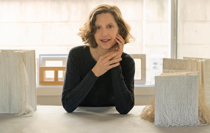
Photo: Bernard Wolf

Hello Gentle Readers…whoever makes their way to this post.

I have transitioned to my new site, and blog, and hope you will too.

It has been wonderful blogging here at Artissima.
The ArtiFactory Studio site and blog will stay up and running for anyone who cares to visit. 

Please do explore my current work and events at DebraDisman.Com…and enjoy my new blog.

Thanks to dear friend and designer extraordinaire, Dianna Jacobsen of Jacobsen Design, for her devoted and wondrous work on the site, and all of her advice, counsel and support during the process.

See You There.

Wishing You the Bestest…
debra disman


“We Right The Book” VI

“We Right The Book” VI

I was honored to serve as Artist in Residence at Verdugo Hill High School in Tujunga,  CA (Los Angeles) for a group of 41 Senior English class Visual and Performing Arts (VAPA) students.

Our project ,  “We Right the Book” was supported by an Artist in Residence grant from the City of Los Angeles Department of Cultural Affairs.  I worked with the students on a series of bookmaking projects during weekly workshops held right in the classroom from September – December, 2017.

The students’ completed book works were exhibited at the Sunland-Tujunga Branch Library on December 13, 2017.
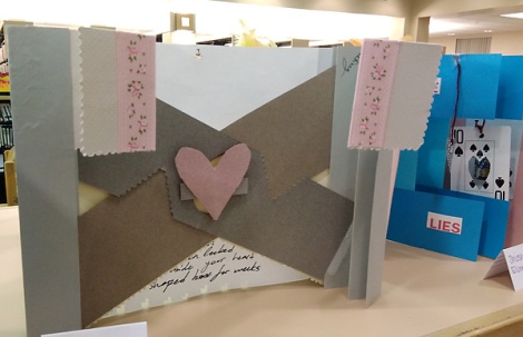
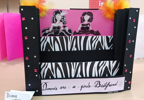
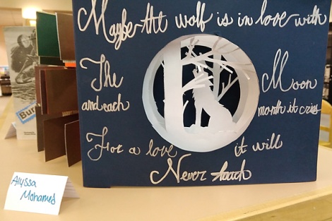
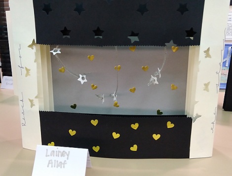
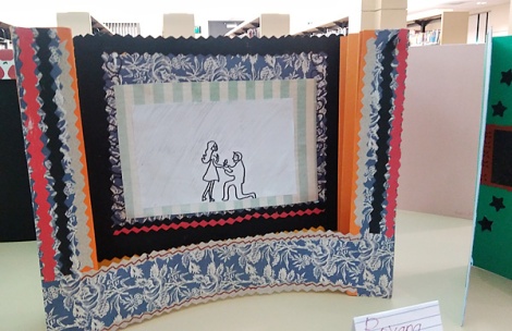
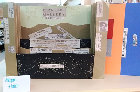
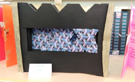
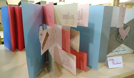
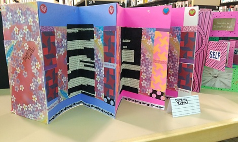
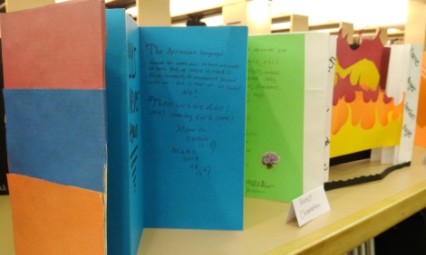
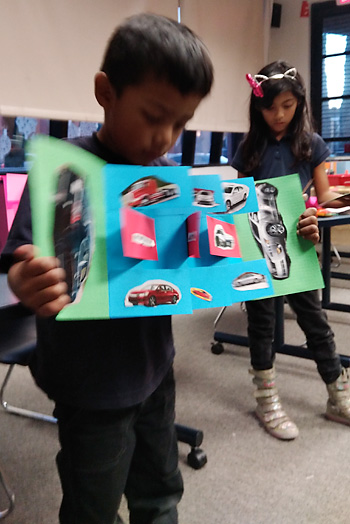
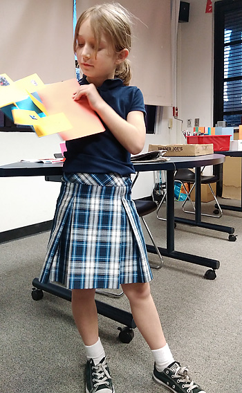
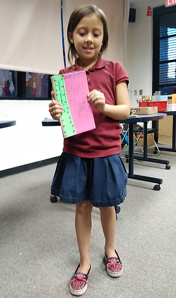
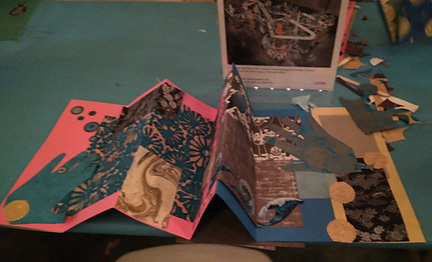
Accordion fold books, flag books, tunnel books, scrolls, and side bound books…the results were stunning.
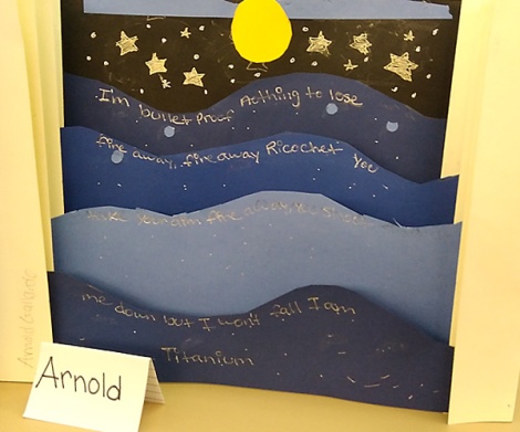
Below is a digital tour through the show.

Each student’s works were displayed together, except the scrolls, which were hung on the walls.

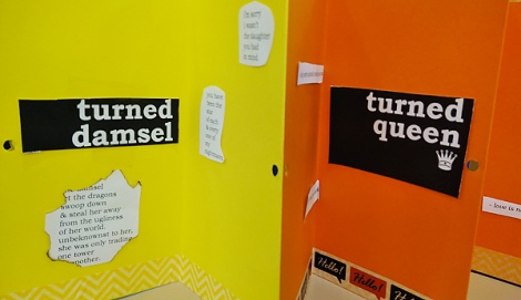
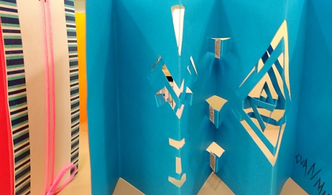
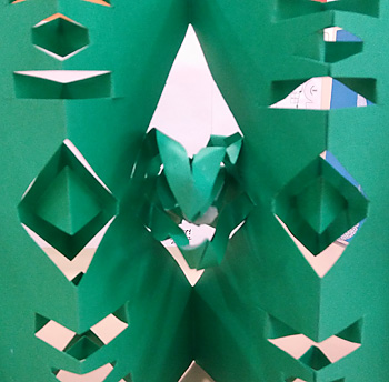
Students created extraordinary Tunnel Books with whimsical, innovative and imaginative use of materials.

They made Flag Books…with “Found” (collected from existing print media) Writing.

and Accordion Fold Books

with elaborate pop-ups.


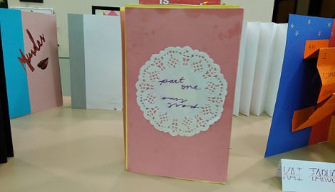
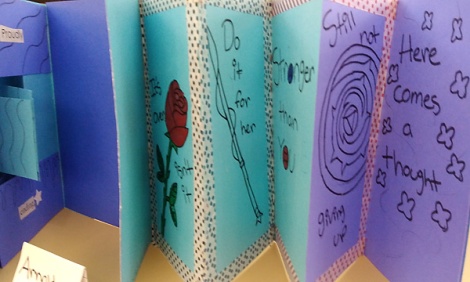
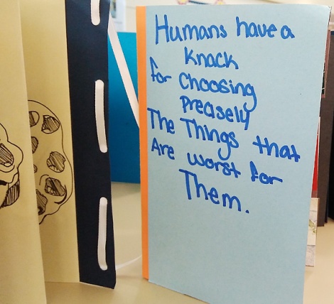
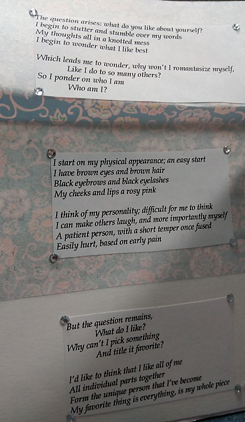
The students completed their final projects for the class in their side bound books…the theme: IDENTITY…Who they are…Where they want to go…How they see themselves.

A Junior VAPA English student peruses the side bound books. She looked at each and every one.


I would love to work with her next year!

Fingers Crossed for next year’s Residency!
Thank you, LA DCA.

“We Right The Book” V

“We Right The Book” V

I was honored to serve as Artist in Residence at Verdugo Hill High School in Tujunga,  CA (Los Angeles) for a group of 41 Senior English class Visual and Performing Arts (VAPA) students.

Our project ,  “We Right the Book” was supported by an Artist in Residence grant from the City of Los Angeles Department of Cultural Affairs.  I worked with the students on a series of bookmaking projects during weekly workshops held right in the classroom from September – December, 2017. Students also assisted with bookmaking workshops held for the community at-large in the Sunland-Tujunga Branch of the Los Angeles Public Library.

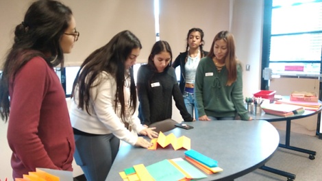
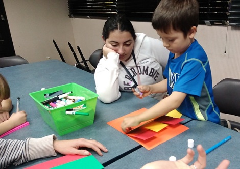
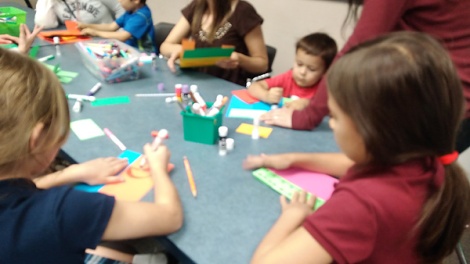
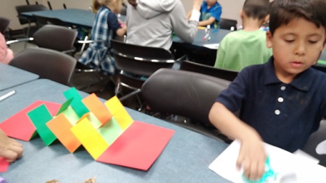
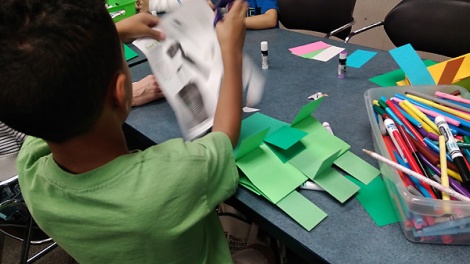
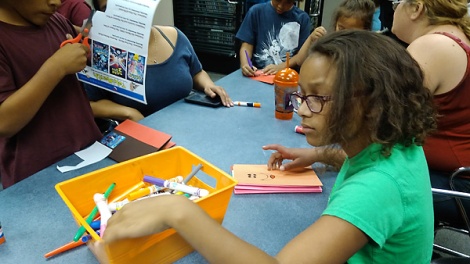
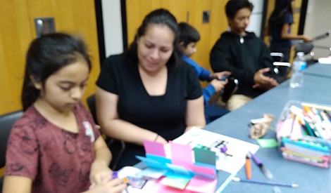
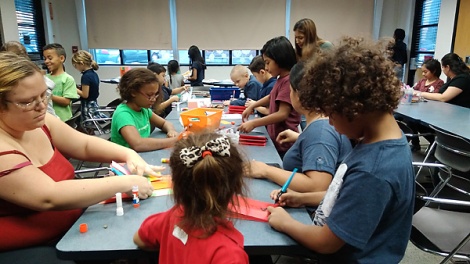
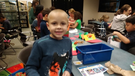
In our Library Program on November 29, 2017, five wonderful student artist teacher assistants helped to teach the Flag Book structure, to a group of children ranging in age  from 5 – 12, accompanied by parents, grandparents and other family members.

The students demonstrated how to fold the accordion spines from “bright tagboard”, add railroad board covers, and finally, attach the flag pages.

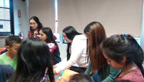
The students shone at showing techniques, then moved through the crowd, assisting participants one-on-one.

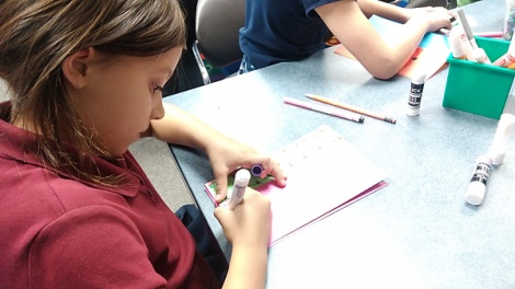
Once the books were assembled, participants could experience the joy of developing them….

adding color, collage, drawing, stickers,

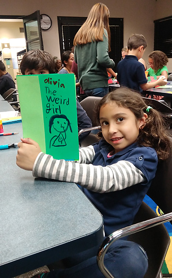
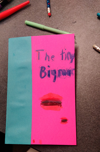
and Titles!

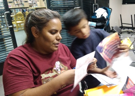
Mothers worked side by side with their children…

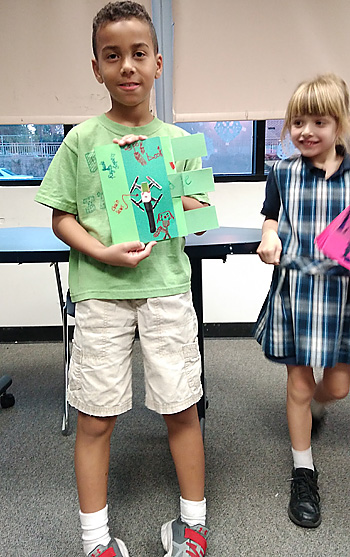
Upon completion, participants proudly shared their books with the group.

It was beautiful to see and hear! 

On-Site: Neighborhood Partnerships with the Los Angeles County Museum of Art

On-Site: Neighborhood Partnerships with the Los Angeles County Museum of Art

Please enjoy reading a wonderful post written by Karen SatzmanDirector of Youth & Family Programs at LACMA, The Los Angeles County Museum of Art…

I was honored to serve as teaching artist for a series of onsite LACMA art making workshops on “People Street“, in North Hollywood, in the NoHo Arts District.

Upcoming NoHo LACMA art workshops include:

Make a Flag Book 2 pm
2 pm | Sat, October 14, 2017
Participate in a free artist-led workshop and create your own artwork in response to works in LACMA’s collection.
North Hollywood | Valley Plaza Branch Library
Free and open to the public
Note: This program takes place off-site on 12311 Vanowen St., North Hollywood, CA 91605
This project is supported by a grant from The James Irvine Foundation.

Make a Tunnel Book
2 pm | Sat, November 18, 2017
Participate in a free artist-led workshop and create your own artwork in response to works in LACMA’s collection.
North Hollywood | Valley Plaza Branch Library
Free and open to the public
Note: This program takes place off-site on 12311 Vanowen St., North Hollywood, CA 91605
This project is supported by a grant from The James Irvine Foundation.

Make an Accordion Book
2 pm | Sat, December 9, 2017
Participate in a free artist-led workshop and create your own artwork in response to works in LACMA’s collection.
North Hollywood | Valley Plaza Branch Library
Free and open to the public
Note: This program takes place off-site on 12311 Vanowen St., North Hollywood, CA 91605
This project is supported by a grant from The James Irvine Foundation.

 JOIN US!


Hand-i-Work: Making Books

Hand-i-Work: Making Books

Picturing Bookmaking…the work of our hands.

WEBf

WEBx

WEBg

WEBv

WEBh

WEBi

WEBu  WEBw

Saying goodbye to summer 2016 “Wonderland: The Book Makers’ Studio. Cherish the memories!

Until next year…walk in peace, and make books…read them too!

2012 in review

The WordPress.com stats helper monkeys prepared a 2012 annual report for this blog.

Here’s an excerpt:

600 people reached the top of Mt. Everest in 2012. This blog got about 8,000 views in 2012. If every person who reached the top of Mt. Everest viewed this blog, it would have taken 13 years to get that many views.

Click here to see the complete report.

Published in: on December 30, 2012 at 6:28 pm  Leave a Comment  

Featured Work: Berkeley Bungalow

Featured Work: Berkeley Bungalow

Berkeley, California is a place of bungalows. There are many, many bungalows in Berkeley.  You might even say that Berkeley is a bevy of bungalows.  These charming houses, home to many a professional, family, and couple, are clothed in a myriad of hues, which upon occasion, an owner will decide to change.  One such delightful owner (referred by the San Francisco-based painting company, Modamas Fine Painting) engaged me  last September to guide her through the initially overwhelming and confusing process of choosing new colors for her home’s exterior. Our our first step was  to not only look at her home’s exterior with a critical eye,

but also to walk through her neighborhood  and peruse the color schemes of other bungalows.  She had several color directions in mind, and needed to narrow down the choices.

We discussed cinnamons, greens, teals and grays for the house body,  though she really wanted purple.   Ultimately, a rich yet soft Benjamin Moore brown was chosen,”Chocolate Pudding-1014“.

The warm Benjamin Moore “Antique White-OC-83” made a perfect trim accompaniment, balanced by elegant black address numbers and bannister.  The black detailing created a graphical counterpoint to the generous areas of creamy white trim.

We were then on to the all-important front door. Despite her penchant for purple, my Client saw that it did not work.  Wanting warmth and degree of contrast, we went towards red instead. Red doors are a frequent accent in Bay Area architectural color schemes, but, which red was the question?  Benjamin Moore “Apache Red-1295” reflected too much pink.  “Sweet Rosy Brown-1302” added just the right degree of redness, without creating unwanted pinkish undertones.  The entry now radiated warmth and welcome.

Finally, the front steps were painted in Benjamin Moore “Fresh Brew-1232“, grounding them and the house in a deep earthy brown, and  completing the delicious ensemble.  The steps bring out a bit of the earthy red in the door as well.

Warm white trim frames the house, giving an upward feel to the roof. The white against the sky and  tree connects the earthy house colors to the blue and green of nature.

White trimmed windows look crisp against the house’s boxy side, which is also softened by the natural wooden fence, and greenery.

Greatly  improved by the new color scheme, this area now looks tidy, compact, and integrated with the rest of the house, a perfect set of bungalow qualities!

The detached garage also greatly benefited from a new suit of “color clothes”…

Amazing what a fresh coat of paint will do…with the proper prep. of course,

especially in the “right” colors.  In this case, Benjamin Moore “Classic Colors” collection was our go-to  color source. “Chocolate Pudding”, “Sweet Rosy Brown”, “Fresh Brew”,  what a visual feast!  My visionary Client took the time to have samples put up of each color we considered, and observe how the color played on the house surface during different times of day, light, and weather.  She had the patience and the perseverance to see her project through.  As she confessed to me, ” I can’t wait to finish this project. Several times I just wanted to let it be, but I want to be thoroughly happy.” And, I am happy to report, she IS!

Have you had a interesting color connection lately?  A visionary client, an innovative creation, a heartwarming transformation?

If you feel so inspired, please share it with us here.  We love to hear from you.  Remember, we are all coloring through this thing called Life, together.


Color Muze News, Views and Hues: Transformative Color

Color Muze News, Views and Hues: Transformative Color

I continue to be inspired by serving as the Color Muze for Cre8tive Compass Magazine, and Artistically Speaking talk show.  Helmed by Rebecca E. Parsons, creative “arte-preneur” extraordinaire, and master decorative artist, Lyna Farkas, Artistically Speaking is a popular blog talk radio show focusing on the visual arts.  It features interviews with artists and creative entrepreneurs that educate, intrigue, inspire, and inform us about how to experience, grow and create our Art, Business and Life, mixing and matching along the way!

Each third Sunday of the month at approximately 7:15pm EST, I join the delightful Rebecca and Lyna, to offer tips, share real-life stories, and provide guidance in the powerful and awesome realm of Color.  I will also be providing follow-up Color Muze articles for Cre8tive Compass Magazine, like this one!  SO, sit back, listen up, read, and enjoy the show!

In January 2011 we muzed about the emotional, communicative and transformational power of color, discussing real-life examples.  I’d like to share one of them here with you.

A beloved client, with whom I have worked for over a decade, found her charming but rather dark kitchen very depressing.  Over the course of time, she had added some stained glass, and worked with me to paint out areas of the dark woodwork which predominated in the room.

During the course of our work together, she had a period of great personal challenge that demanded tremendous strength and fortitude.  Although we had enhanced her kitchen and other areas of her home over the years, she felt strongly that the dark tenor of this important area was still affecting her state of mind, and needed to be transformed.

Astonishingly, the remains of the paint we had used in her kitchen years before was found, and she was able to get more of it from her local vendor.  We used it to paint out more of the dark wood trim and doors. The warm golden ochre color had been chosen to brighten the room (which gets little natural sunlight), as well as to set off the visual treasures displayed there.  True to form, the hue created its contextual magic once again.


“The final outcome of the project was transformational. “ said my client.What had been a dark and brooding extended kitchen area became a light and inviting space that perfectly wove into the accent colors already in place. The end product created a welcoming environment and one that now highlights the unique wooden carvings within the rooms.”

This statement is truly a testament to the transformative power of color.  It can support your life, and help you through dark and demanding times.  The “right” color can offer lightness, joy, grace and positivity to any space, in any context.  In other words, color can help you live.

During our Muze on January 16, 2011, I offered a way to approach our color decisions by suggesting three aspects to take into consideration when we are making them.  These aspects are:

  • Purpose
  • Effect
  • Context

These three aspects or considerations as regards to choosing colors can be seen as a three part lens through which to view color in any context.  I suggest you try writing these out in the form of a chart, a list, a set of questions or even a story, and see if this activity proves helpful to you in making color decisions.

In regards to my client’s color story related above…what was the Purpose of the color she was choosing for her kitchen? Well, the Purpose was to elevate her mood, communicate and support a sense of optimism, energy, happiness, cheerfulness, positivity and possibility.  A hue in the yellow family was chosen, not a lemony yellow, but an earthy one, which worked with the colors, textures, architecture and general sensibility of the room and its Purpose, as well as the home as a whole.

The Effect of the chosen hue is warm, light and bright (in comparison to the dark wood it covers), yet earthy and comforting.  Associated with the sun, candlelight, flame, and firelight, as well as gold and gladness, an earthy hue of yellow is perfect in this room for the Purpose described above.  We associate yellow  with optimism, energy, happiness, cheerfulness, positivity and possibility. Think “sunny” disposition!

What was the Context for this color?  As regards to Place, the kitchen is considered by many to be the hearth, heart, and nucleus of the home.  When I visit this particular Client, who has become a friend over the years, we don’t sit in the living room to chat; we sit in the kitchen. Thus our color needed to be appetizing, inviting, invigorating, but also relaxing. The choice of a warm, earthy golden hue also helps compensate for the lack of natural light in the room. In terms of the existing Design and Architecture of the room, with its cream walls, dark wood ceiling beams, ochre backsplash tiles, brick red tiled floor, and lighter brick stove area, our color needed to play nice with all of these elements, integrating, and not competing with them.  Finally, the room holds a number of Objects and Accents treasured by my Client: decorative plates, ceramics, and stained glass, which hang on walls, windows and doors.  Our hue needed to set off and work with these as well.

Purpose, Effect, Context is a way to think about, consider, and approach color.  The “P.E.C.” approach can be applied to your decision-making process about color in any context: web or graphic design, interior design and architecture, textiles, craft, decorative painting, and even fine or conceptual art.  Give it a try…its fun! Thinking in terms of Purpose, Effect and Context may help you sort out your color challenges with greater ease,  and allow you to experience the pure joy and pleasure of color more fully.

What a luscious, luminous world we have as finishers, decorative painters, muralists, artists, artisans and humans, to explore! Please join our Color Muze on Artistically Speaking Talk Show, and Cre8tive Compass Magazine, “where we honor your passion, and your vision, in this community we are co-creating”

Here’s to a colorful journey!


Color Muze Quarterly: Our View on Hue II

Color Muze Quarterly: Our View on Hue II

This post is based on an article written for  Cre8tive Compass Magazine, published 01/2011.

Color Muze” is a five-minute segment on Artistically Speaking, a popular talk show on blog talk radio which airs at 6:30pm EST, most Sundays.   Color Muze comes on the show each third Sunday (mostly) at 7:15-ish EST.  Please join us for Color Muze Hues, News and Views, on Artistically Speaking Blog Talk Radio.  The good news is, you can hear the shows on your computer…anytime!

And now…let the COLOR begin!

Here is a round-up of some of our favorite Color Muze tips and tidbits from September, October and November of 2010 on Artistically Speaking.

Spearheaded by Rebecca E. Parsons, creative entrepreneur extraordinaire, and master decorative artist, Lyna FarkasArtistically Speaking has undergone some transformations in the New Year, and we are excited about what 2011 has in store for its listeners, and the readers of Cre8tive Compass Magazine.

In the future, we look forward to enhancing our Color Muze offerings with a variety of Color-Full articles to enrich your know-how, experience and practice of color. We look forward to continued “Muzing” with you about the fascinating, and ever-unfolding world of Color!

In September, we continued our discussion of The Color Wheel with a focus on complementary colors, and their relationship to each other.  The complements are sets of colors opposite each other on the color wheel, and comprised of one primary color (red, blue, yellow), and one secondary color (secondary colors result from the mixing of two primaries: purple, green and orange). Note: we are talking about pigment-based color mixing in this article.

The primary hues of red, yellow and blue set each other off when juxtaposed, as in the layered look created by these three rooms. The red room opens to the blue, which opens to the yellow (gold), creating an intense, saturated effect.

Likewise, when sets of complements, (opposite each other on the color wheel), are placed next to each other, or overlaid without transparency, they will enhance each other. Try using sets of complements in a room, on a canvass, or in a garden planting, and watch each color take on new life!

Yellow ~ Purple

Red ~ Green

Blue ~ Orange

Even when sets of complements are toned down, or made less bright,  they will set each other off when placed next to each other.

In fact, one way to subdue, “neutralize”, or gray down a color is to add some of its complement to it, thus lowering its level of intensity and saturation.

On the ceiling below, a semi-transparent rusty-orange-is layered over complement cerulean blue, subduing the intensity of the blue in areas. The coppery-orange of the stencil design is more opaque (paint, as opposed the more sheer glaze medium), thus mixes less with the blue below it, and stands out in greater contrast to its blue background.

Color can have a tremendous effect on our psychology, and emotional lives. In October we talked about how painting a kitchen’s dark, light-absorbing wood a golden-ochre color changed the life of its inhabitant.  A testament to the power of color, the homeowner declared, “The final outcome of the project was transformational. What had been a dark and brooding kitchen area became a light and inviting space that perfectly wove into the accent colors already in place. The end product created a welcoming environment.”


Illustrating the symbiotic relationship of light and color, we discussed how color on a ceiling can look very different then the same hue on a wall, depending on how the light hits and is absorbed by each surface. This concept is discussed beautifully in the book Color and Light: Luminous Atmospheres for Painted Rooms., by artists and colorists Donald Kauffman and Taffy Dahl.

Although in many places, November is a bit too cold to do exterior projects, during Thanksgiving month we shared about how to deal with choosing colors for exterior surfaces that are constantly shifting hue in the changing light outdoors.

One way is to observe the surface you are trying to match, or work with, such as a patio’s expanse of multi-colored Mexican tile, determine which color stands out as the most dominant, and base your treatment on that hue. We shared, and laughed about, a helpful simple trick when doing this: if you wear glasses, take them off!  You may find that you can see the fields or areas of colors you are trying to work with more clearly, without the distraction of “clear” vision! (And, make sure you aren’t wearing your sunglasses when observing, planning, and choosing colors for your project!)

We chatted a bit about the challenges of changing paint formulas, as Benjamin Moore and other vendors create a whole new set of more environmentally friendly color specs that don’t necessarily exactly match the old!

Anyone specifying color will be affected by this, and though we all appreciate our vendor’s attempts to “green” their products, we caution you to be prepared for some confusion in the interim, and apprise your Clients accordingly!  I have been told that the old Benjamin Moore color specs will continue to be sold while supplies last…then it’s out with the old, and in with the new!

Remember, any change, even the most exciting and positive, can create a bit of stress, as our senses, hearts, minds and souls take their own time to make the necessary adjustments.

Finally, we completed our discussion with a toe dip into the intriguing concept of Synethesia, or “Unity of the Senses”.   As states Frank L. Mahnke, President of the International Association of Colour Consultants/Designers, “Colors may evoke associations with odor and taste, appear heavy or light, give tactile impressions, be associated with sound, have volume, and temperature associations.”


We look forward to delving deeper into this fascinating material in further Color Muze segments!

What a luscious, luminous world we have as finishers, decorative painters, muralists, artists, artisans and humans, to explore! Please join our Color Muze on Artistically Speaking Talk Show, and Cre8tive Compass Magazine, “where we honor your passion, and your vision, in this community we are co-creating”

What Color-Full journeys have YOU taken lately?

If you feel so inspired, share them with us here.  We love to hear from you.  Remember, we are all journeying though this thing called Life, together.


Taking Flight in 2011

Taking Flight in 2011

What does taking flight mean to you?  New projects, new ideas, new possibilities? A whole new you? (Hmmm…) My colleague, Rebecca E. Parsons recently posted  about her word for 2011: soar, in Cre8tive Compass Magazine.  I found the term very apropos to a project completed in the last days of 2010, which involved painting birds (mostly) in flight, in a young boy’s room.
My client, the boy’s father, wanted the room to become something special and reflect his son’s interests.  Painting (mostly) flying (mostly) colorful birds on the walls and ceiling seemed a fitting way bring the old year down to a soft landing, and take flight into the new.  No time to hover…it was time to take-off!

The initial concept of depicting birds in flight across the ceiling with one Bald Eagle on a designated wall expanded, as I  took off with my avian research of the gorgeously plumed, brilliantly feathered, and stunningly patterned.  Falling under the spell of our endlessly fascinating feathered friends, the project became a labor of love, not lost.

The Parrot ascends,

The Toucan dives,

The Barn Swallow glides by,

The Spotted Owl swoops, but don’t worry, he’s friendly!

Two of the most richly hued herald the entrance to the adjoining bath, perched sentinel atop the door frame.

Color-full beauties contemplate each other in calm communion.

Little Green Bird ( Calyptomena viridis )

Yariguíes Brush-Finch (Atlapetes latinuchus yariguierum)

Just the act of observing birds can teach us so much.  Their gracefulness, the purity of their movement, their strength and agility, the glory of their plumage, their color, the adornment of their astonishing patterns and textures, all worn without a hint of vanity (no Peacocks here!) is  humbling and at the same time uplifting to the human spirit, when we take time to see it. Birds’ beauty and innocence, doing only what nature intends them to do without apparent ego  interference, is a quiet marvel to behold.

Wing your way…

So, prepare to be inspired as you take flight into 2011. Take a lesson from our avian friends, our fellow creatures of the sky, and use this New Year to take off…into whatever you yearn to become.  Of course, there will be those times of hovering, flapping, even of dragging, but don’t let that stop you from lifting, gliding, and making your own ascension.  Don’t worry about a few dives. Like light and dark, up and down seem to be interlocked…two parts of a whole: Life.

Float, glide, dive and circle, but don’t forget to commune, contemplate and converse.

How do you intend to take flight in 2011?  If you feel so inspired, don’t hover and drag, share it with us here.  We love to hear from you.  Remember,  we are all flying though this thing called Life, together.