Color: A Balancing Act

We have all had the experience of sensory overload..as well as sensory deprivation. We may experience overload when entering an environment filled with loud sounds, bright colors, an array of patterns, and a variety of textures…to say nothing of what we may be sniffing, tasting or touching there.

We may experience sense of deprivation when a space is too quiet, neutral, bland, uninteresting, and feels just plain boring. We know something is “wrong”, but we may not be able to put our finger on it, literally speaking, especially if there is a dearth of textures, colors, patterns, and other visual stimuli.

Although our tolerance for visual complexity and variety, as well as unity and coherency varies from person to person, we do expect, and maybe even need, our senses to be stimulated to some extent at all times. Perhaps we are experiencing this through dreams while we are sleeping!

Not surprisingly, even our health and physical well-being can be affected by exposure to over or under-stimulation. Extreme unity, or monotony, can result in restlessness, irritation, a lowered ability to concentrate, wandering attention, and an overly strong emotional response. Extreme complexity/variety can result in higher blood pressure, pulse rate, and muscle tension. Not a good thing, as we can probably all agree.

Knowing this, our job as color consultants/designers becomes charged with even greater purpose and meaning…how to create environments of balance (which doesn’t mean symmetry or the sum of equal parts, which might become monotonous), which support both our physical and our emotional well-being, as well as the function of the spaces themselves, and even our life’s purpose!

Before we get either too lofty, or too weighty about all this, lets look at some color designs and palettes that achieve balance in a variety of different ways. I hope to continue to investigate, explore and disseminate the subject of color balance in further posts. Have fun!

A nearly monochrome palette relieved by creamy white trim can be stately and restful, especially when enlivened by a multitude of decorative detail.

Even a deep, rich, dominating hue such as a burgundy purple can be set off by accents of an even deeper value. The dramatic shift to white in the trim frames a building that the owner wanted to simplify and streamline, while still acknowledging its details.
 A slight amplification in field color from the original,

makes this building more satisfying to look at, as it is more “complex”(contains more color) . The addition of a dark accent color on the window sashes, and a more intense door color add variety, which also increases complexity, and protects against visual monotony.

The temptation to “go color crazy” on this magnificent Queen Anne Victorian could have created so much complexity, that our attention may have been distracted from actually seeing and enjoying its beautiful period details, such as the shift in shingle pattern, decorative insets, and dentils.
 Instead, by limiting the colors to a set of resonant neutrals (field color, field color 200% formula and off white trim color), and adding accents in earthy hues of complimentary sage green and brick-red with just a touch of gold leaf,

we are not so overstimulated by too much variety, and can actually take in and enjoy the details, colors and shapes that integrate to create a unified whole.

The complex but neutral beige body color, and white trim are punctuated by a rich red service door, a singular detail on this building, which has very little embellishment, or even trim.

As the owner wanted to reduce the possibility of visual complexity, subtle interest is brought in by the use of a slightly darker and more intense foundation color, which grounds and visually supports the structure. Thus both over and under-stimulation are avoided, and we experience enough visual simulation to provide a pleasing experience physically and emotionally.

The size, style,, “stateliness” and foliage around a structure can influence color design choices, as well as how much its body is broken up by its trim. Here the deep blue-green color of the house body is significantly relieved by the crisp white trim and garage door, as well as bright green foliage, which becomes a color accent or counterpoint to the dominating blue and white. As the building reads tall and thin, our eye is drawn upward to the sky, which completes the picture. Not seen here is the warm brown accent color used on the planters in both the entry way and back patio, which provide contrast to the blue and green, and complete the triad of blue, green and brown “nature’ colors.

A unified palette can make a building stand out…even if it doesn’t contain an extreme shift in accent color. Our richly hued “old burgundy” beauty commands the street view here. All the more regal for being contained and restrained in color variety, the palette is retrained yet fun, making a statement without overwhelming our senses. The building itself serves as an accent for a block dominated by pale, nondescript and rather unimaginative hues. Maybe, stimulated, but not overstimulated by our royal example, the neighbors will be inspired to follow suite and add more local color!
If You are feeling either over, or under-stimulated in your environment, try experimenting with adding or subtracting color, pattern, texture, changing the value (light to dark), or intensity/saturation (brightness) of the colors, changing your accent color to the compliment of the dominant color in the space, or if there is no dominant color, creating one.
You may just find yourself feeling better on all fronts!
Until next time…wishing you balance, variation, complexity, unity and coherence in your Life!
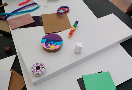 Creating and using color…pipe cleaners, a wooden clothes pin, plastic and paint samples and cardboard ribbon spools!
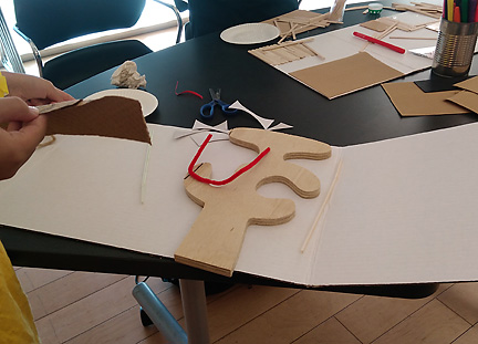 Arranging a wooden cutout (left over from a furniture-making class) and a pipe cleaner on a project board…ready to add other materials.
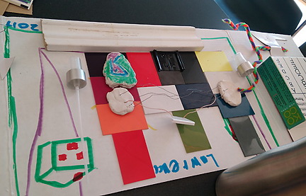
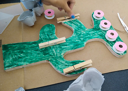 Another young maker using the same wooden cutout in a whole different way. Clothespins and empty spools become hooks and clips for jewelry.
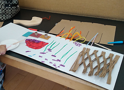 Drawing combined with unique packing material and plastic tiles topped by small spools form the visual structure for this young boy’s world.
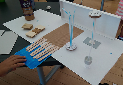 Here the project board is used as a flat base, and din=mension is added with a gift box top, straws, and yet another employment of empty spools.
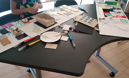
 Lawrence worked what looked to be upside down on his project,
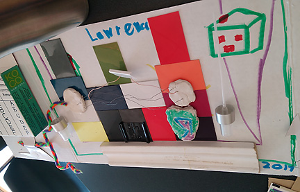 perhaps turning his project board base around to see how it was developing from both vantage points.
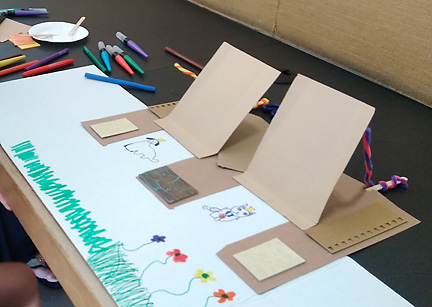 This lovely world of color, flowers animals and doors/flaps which lift up was created by a young girl of preschool age, working quietly in a corner with her mother. She made beautiful use of the materials, arranging cardboard, tile and paint samples and pipe cleaners to beautiful effect. I would love to visit this world for a bit!


