The Big Draw: Exploring Elements of Drawing
This coming Saturday I will be leading a drawing program at The Fairview Library in Santa Monica, as part of The Big Draw LA. I am hoping to get some photos of participants creating big murals on white butcher paper with drawing tools and techniques that The Library and I provide! Here I share the information, concepts, terms and techniques I plan to share with them tomorrow in a handout, and through our drawing projects, which will then grace the library’s walls.
I invite you to learn, study, play, enjoy…and DRAW!
Composition is the placement, arrangement, combination or organization of visual or pictorial elements such as line and shape in a work of art. Composition is not the subject or theme of a work. It is the arrangement of everything we see within the borders of a drawing or other work.

The foreground, middle ground, and background are three parts of a composition that can help to create the illusion, or sense of depth in a flat or two-dimensional artwork such as a drawing or painting. The foreground is what appears closest to the viewer, while the background looks furthest from the viewer. The middle ground is located between both the foreground and background.
Line is the most basic element of the drawing. Lines span a distance between two points. Lines are what separate one area of the drawing from the other. A single line will divide your drawing into two areas. The more lines that are added, the more complex and detailed your drawing becomes. A line has a width, direction, and length. A line’s width is sometimes called its “thickness”. Lines can be all the same width or a single line can vary in width. A line can start out thin, get thicker, and then get thin again, depending on your drawing tool, and how you use it. Lines of varying widths can add interest to your drawing!

Shape is another important element of visual art. Shapes are flat spaces enclosed by lines. The boundaries of shapes are, or create, lines. Shapes are limited to two dimensions: length and width.

Shapes can be geometric, such as squares, circles, or triangles, or organic, such as the natural shape of a puddle, cloud or leaf.

Geometric shapes have clear edge, are precise, and related to mathematical principles. They can require a guiding tool to draw such as a ruler. Geometric shapes usually look organized, and have names such as circle, square or rectangle. Most geometric shapes are made by humans, and don’t often appear in nature though crystals, which appear in nature, are considered to be geometric.
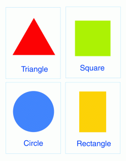
Organic shapes have less well-defined edges, a natural look, and are usually outlined in curvy lines. They are typically irregular and asymmetrical (not exactly the same on both sides). Organic shapes usually do not have a name. They aren’t circles or squares. People, trees, flowers and other things that have been alive or are alive are usually made up of organic shapes.

Space is the distance or area around, between, above, below or within what is put into the composition. Space includes the background, foreground and middle ground of a composition. There are two kinds of space: Positive and Negative Space.

Positive space is best described as the areas in a work of art that are the subjects or actual things being shown. The area around the positive space is called the negative space. Negative space is area around and between the subjects or things being shown in a work of art. Which is the negative space, and which is the positive space in the image below?
 Is the negative space the black shapes around the white goblet, or is it the white space between the two faces? Is the positive space the white goblet, or the black faces?
Texture, another element of art, is the way a three-dimensional surface feels to the touch, or how the surface of a two-dimensional or flat work looks like it might feel if touched, I.E., its “visual feel”.
 Visual Textures created through Drawing
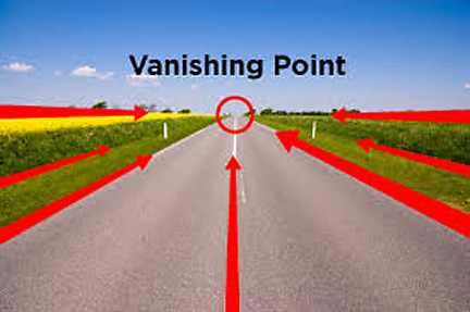
Objects appear smaller and closer together as they recede in the distance. This is how we see. Things aren’t actually smaller and closer together when they are farther away, they just look that way, and how our eyes perceive distance. This is called perspective.

Perspective is the illusion the further away things are, the smaller they appear. Perspective drawing is a system of representing the way that objects appear to get smaller and closer together, the further away they are. To make something appear to be farther away from the viewer than the picture plane, draw it smaller than the object that is closer to the picture plane.

Perspective is the technique used to represent a three-dimensional world on a two-dimensional/flat surface, such as a piece of paper, in a way that looks realistic and accurate, as we would see it in real life. Perspective is used to make a flat image look as though it has space and depth.

The horizon (or skyline) is the line that we perceive as separating earth (which includes bodies of water on earth) from sky. The horizon line is also known as eye level. In real life, the horizon is where the land (or sea) and sky meet. In creating a flat/two-dimensional work of visual art, it is the level your eyes are at, an imaginary line to which things recede.
 Horizon line…at the horizon
As things get further away, from us, they seem smaller and closer together. When they get far enough away, distances become ever tinier and so form a single point, called the vanishing point.

In perspective drawing, the vanishing point is the spot on the horizon line where receding parallel lines appear to come together, or converge. It is the point where buildings, rails, roads and anything in the background of a drawing or other flat work of art seem to converge into one single point on the horizon, where objects seem to disappear.
Foreshortening is a technique used in perspective to create the illusion of an object receding strongly into the distance or background. .Foreshortening is used in drawing to create a sense of depth and make objects look like they are going back in space. Of course they aren’t…they are drawn on a flat piece of paper or other two-dimensional surface.

An example of actual foreshortening is when you look down a long straight road lined with trees and the two edges of the road appear to move towards each other, while the trees look smaller the further away from you they are…until they seem to disappear altogether, at the vanishing point.

Proportion is a principle of visual art that refers the size of one picture element in relation to the size of another, such as the size of the head in relation to the rest of the body.

Proportion can give a sense of balance and harmony to a drawing, or other piece of visual art. It is similar to scale, which is how one object relates or compares to another one in size, such as how a dog relates to a cat, or a cat to a rabbit, as regards to size.

If you happen to be around the Los Angeles Area tomorrow, October 25th, and want to drop into the Fairview library between 12 and 3PM and join in the creative fun, please do! Until then, maybe this post can illuminate and inform your approach to drawing, and broaden your knowledge and even your skill!
Practice makes, well, there is no perfection, but practice certainly does help, so, draw on!
 Students of their own volition devised a theme,
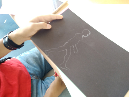 such as this figure hiking,
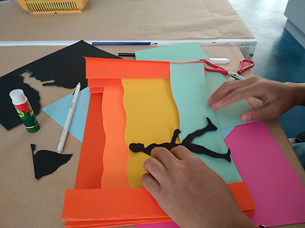 and followed it through, in this case in silhouette form.
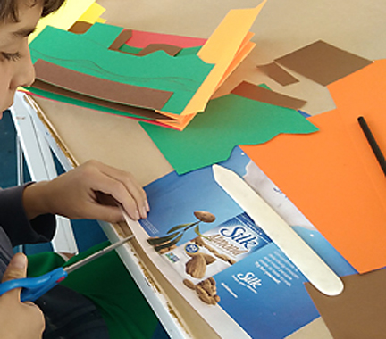 This young artist found images from magazines,
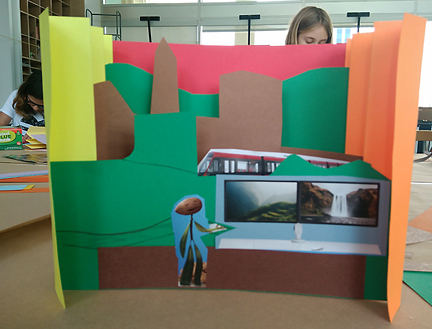 and created a scene with them.
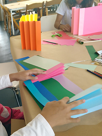 Some created land, city and seascapes through cutting and shaping paper and cardstock strips, and adhering them to the spines,
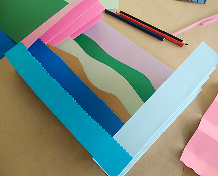 to beautiful effect.
 Students” individual color choices are always interesting…
 and often very consistent…also with their clothing color choices, and probably more.
 This innovative and well-traveled maker added the words, “Paris, London, New York” on these strips. her travels and where she has lived with her creative family is an important part of her identity.
 The red spines on either side create a theatrical effect in this piece, that this bookmaker worked on with meticulous attention to detail, and tender loving care, as she did with all her projects.


 even if the scene is fantastical!


 Sketches and mockup for “The Donor Tree”
 “The Donor Tree”, Planning for Elders in the Central City, San Francisco
 Mockup for “Window Mural”


 “Garden Mural”, patio level, San Francisco
 “Life Journey”, living room wall, Burlingame, CA

 “Obi-Cat” on music room door, Palo Alto, CA