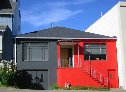
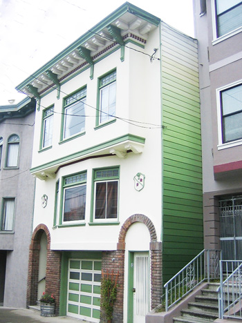
Brand of Colors: Color Etiquette for your Graphics
When friend, colleague and client Debbie Josendale founder, creator, and president of 3C Marketing Group LLC contacted me to get my opinion on the colors in the graphic below, I dove in headfirst, and delivered an analysis of not only the colors, but their placement, qualities, and distribution.

It is a process I find fascinating, and I never tire of both studying, and analyzing how, why, and where colors work best for the purpose they are being employed…or not. When the colors are “not working”, sometimes a slight tweak will do the trick; changing the placement, value, chroma, or saturation of a color, or how much of it is being used. Other times, a greater overhaul of the color palette may be requited.
Debbie knew that something was not right in the graphic above…not in balance. She knew the feeling she wanted communicated wasn’t quite there yet.
I saw immediately that the central “bar” of color, surrounding the word “AUTHORITY” was too dark, and needed some brightness and warmth to fully communicate the idea of “AUTHORITY” as a positive, powerful, and in essence, beautiful thing to the viewer. I suggested that instead of the deep, almost blackish green (on my screen, and in this age of individual internet screen and printers, who knows what any given pair of eyes is seeing…), that a a mixture of the top green, and bottom blue, IE, a warmer, clearer, yet still strong, teal be used, to distill the positive message of leadership and problem-solving.
I also suggested that the lighter, brighter green, used at the bottom of the graphic be moved to the top, and the deeper blue at the top be used at the bottom, to “ground” the “page”, as is done in architectural color consulting. Deeper, darker, and stronger color used on the foundation, or lower part of a building can “ground” it, making the building as a whole look more rooted, stable, and solid. By moving the green to the top of the “page” or view, I felt a more expansive, airy, and optimistic feeling could be created.
Finally, I advised that the top blue block, encasing the Map Marketing (TM) Method lettering be altered in some way that again, would make it less heavy, and also differentiate from the blocks of color below. This is challenging, as this lettering/text serves as a logo, and thus changing even its scale could be tricky.

Well, Deb and her team made the majority of the adjustments I advised, to the graphic. Above you can see the beautiful teal color which replaces that dark blackish-green surrounding the word AUTHORITY”, relieving it of that “black hole” feeling. Not only was the green from the original moved from the bottom of the piece to the top, but a cooler hue of green, closer to the central teal, and less yellow is used, bringing the piece as a whole into greater color harmony. The blue at the bottom is also adjusted to be closer to the teal, a greener blue, rather than the original “royal” blue, and is now separated from the “title” color bar/block at the very top.
We are still working on what can be done with that top color block, which I feel still, is too strong and heavy, visually “bearing down” on the rest of the graphic. The left side of the top color “block” overhangs the words in color read sideways, which are surrounded by the white background, giving it the sense of being off-center, and bearing to the left.
Enlarging the white text inside that top blue block would alleviate this to some extent, but my advice would be to lose that top block of color altogether, and make the text itself blue, and maybe a bit larger and heavier, to fill the space.
We will see what 3C decides to do!
In any event, the general consensus is that the graphic as a whole is much improved, and better communicates the feeling its creator wants to project. Voila the power of color, how much of it is used, and where!
You can hear our “Color Muze” discussion on Rebecca E. Parsons‘s blog talk radio program, “Artistically Speaking Talk Show” on this subject, preceded by a wonderful interview with paper artist Helen Hiebert. You can also catch previous “Color Muzes” here, in Cre8tive Compass Magazine.
From all of us to all of You: here’s wishing all of You the right color mix for You and Your color needs…today!